

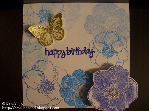
A friend's birthday was just around the corner and i took it as an opportunity to make a fun card for my dear friend. With no circle die cut or punch around, I took the liberty of interpreting the sketch in my own little way. Here is what I came up with:
Stamps: Flowers Bouquet (Martha Stewart), Butterfly from Embossing Stamp Set (Martha Stewart), Sentiment (?)
Paper: White (Recollections), Off-white (Recollections)
Ink: Momento - Paris Dusk, Summery Sky, Blue Danube, Bahama Blue (Tsukineko), VersaMark - Watermark (Tsukineko)
Embellishments: Gold Embossing Powder (Ranger), Sparkling Diamonds (Memory Box), Golden Rod (Prisma Markers), Blue - Art No. 88/41 (Stabilo)
I've been wanting to make my own pattern paper for a while now, and decided to go crazy and make some blue flowered paper. I knew that I wanted to create one bold flower and pop it off the page after I looked at the sketch. Therefore, my darkest blue ink was set aside for that. The nice thing with the MS's flower stamp set is the versatility of solid and line flowers. I tried to balance the blues with the solid and line types of flowers, but I'm not completely happy in how it turned out. Next time, I want to try less ink shades (i.e., maybe just pick two or three colors, rather than four) or stick with one type of flower (i.e., all lines or all solids).
Next I stamped the sentiment with Paris Dusk, but didn't like that it was not bold enough. To make the sentiment darker, I took a dark blue Stabilo pen and traced the sentiment over with the pen.
The butterfly was a natural accent to tie the flowers together. And I did have to satisfy that top circle in the sketch somehow ;) So, off I went to heat emboss it in a nice, rich golden color to complement my bouquet of blue flowers. To balance the gold butterfly, I added a few clear gems, that I dutifully colored with my Prisma marker to match. So all in all, a fun card!
The one revelation that I came to, as a n00b (or newbie) to paper crafts, is the quality of card stock paper. The 65 lbs. paper does not cut it anymore for me. I easily get frustrated when mounting things to the base, and everything feels too unstable. A good card, after all, should be able to prop up and stand on its own, right? So my question to you, what kind of card stock do you use? And what were your first revelations when you started crafting that made you frustrated?