Showing posts with label stamping bella. Show all posts

Thursday, June 7, 2012

[Paperplay Challenges] Week No. 23 - Back to Kraft Basics

Note: If you are looking for DYSU challenge - please keep scrolling :)

Hiya - me again :) All my blog posts seem to be piled on back to back... so please feel free to scroll back a few to see what I've been pulling out of my sleeves...

At PaperPlay Challenge we are kicking it back a little with some back to basics Kraft. I love how Kraft can be so versatile, in color, in texture, and in style. You can dress it up, or down, be whimsy, be girlie or masculine. It's really a nice canvas...


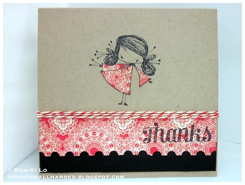
Thanks
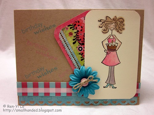
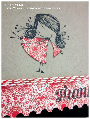
Stamps: (Ketto - Sake) Stamping Bella
Paper: (Paper Basics Card Stock - Kraft, True Black) Papertrey Ink; (Stella & Rose - Gertie) My Mind's Eye
Ink: (Memento - Tuxedo Black) Tsukineko
Embellishments:  (Border Punch - Postage Stamp) Fiskars; (Red Twine) Doodlebug


Just a little simple card, based on the red, black and kraft color theme...And a little bit of paper piecing to match the dress and pattern paper border. Little Sake is cute, isn't she? I think I love the eye lashes and the hair...

Thanks

Anyways, please hop on over to the other PPC girls and see what they have created for this week's challenge. They have always lovely creations and bring great ideas to the table!

Our sponsor this week:

  • Simon Says Stamps

Saturday, October 23, 2010

Caring Hearts Card Drive Blog Hop


Welcome and thank you for stopping. You should be coming from the talented and fun Paulina (aka PrettyPinkPosh). If you happen to stumble here by way of another means, I'd like to encourage you to start from the beginning of this wonderful blog hop.

The beginning happens to be also my dear friend Vera's blog (who I met at CHA this year!) - the amazing person that put this Card Drive together. The card accumulated from this drive will be sent to the elderly that are in nursing homes or care centers. The goal is to bring some smiles to their faces during the holidays (i.e. Thanksgiving, Winter/Christmas).

What is even more amazing, many of Vera's favorite (and my favorite) stamping companies are throwing in some delicious prizes to support this good cause. You have until November 15 to create a Thanksgiving, Christmas, or Winter Holiday card and upload it to this blog post. More details about the card drive are also posted over there. So, what are you waiting for?


Another amazing thing - Vera is part of the Wee Memories DT. And the entire Team is backing her with this week's challenge as a way to get the word out there. Isn't the team spirit just amazing?

Oh right, I suppose you want to see a card. 
(Did I mentioned I got sandwiched between two crazy talented ladies whose work I adore and draw many of my inspirations from?! I feel a tad intimidated by their talent - so lower your expectations by manifold ;) br/>
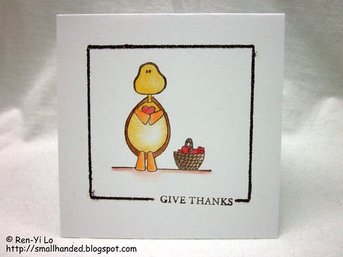
Here's my contribution to help inspire you to make a card. The best part? It is a super simple layout which you can tweak however you want.


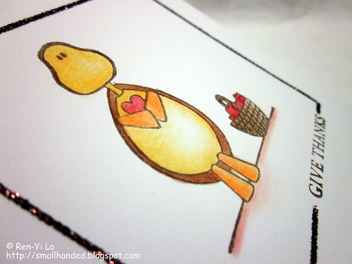
Give Thanks
Stamps: Turtle Tot - Love is in the Air (Stamping Bella); Bountiful Basket Additions (Waltzingmouse Stamps)
Paper: Paper Basics Card Stock - White (Papertrey Ink)
Ink: Earth Elements - Close to Cocoa (Stamping Up!)
Embellishments: Softcore Color Pencils (Prismacolor); Essential Color Glitter Set - Brownstone (Martha Stewart)


Give Thanks

Think of what smiles this little card will bring to those spending the holidays alone in a nursing center! It is a great cause and I hope you will consider supporting it by sharing your creative gifts with these strangers.

Now off you go to be inspired by the brilliant Sarah Martina Parker. Oh how I adore her and her work.

Friday, October 15, 2010

Happy Birthday

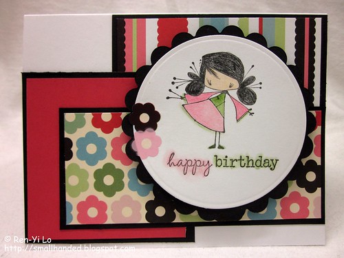
So October is the beginning of a crazy birthday month. So here is one of many birthday cards to come.

To help jump start some creative juices, I turned to this week's Sweet Stop Sketch.  Here the week's challenge:


Since this is a card for my little "sister" Elena (a friend's daughter), I decided my Stamping Bella's Kettos would be perfect to ink up. The funny thing is, Em decided this week's Bellarific Friday's theme is "Ketto." Funny coincidence or what? I say this is a calling!

Happy Birthday
Stamps: Sake Ketto (Stamping Bella); Half-pint Heroes (Waltzingmouse Stamps)
Paper: Paper Basics Card Stock - White (Papertrey Ink); Penelope's Potpourri (Taylored Expressions); Scrap Pack - Black (Recollections)

Ink: Pigment Ink - Black (Colorbox)
Embellishments: Rub-ons - Penelope (SEI); Softcore Color Pencils (Prismacolor); Nestabilities - Classic Scallop Circles Small, Standards Circle Small (Spellbinders)


Here a close up up, close and personal look on Frosty's sparkling hat and snowy base.

Happy Birthday

Isn't she just delightful? Just like my lil sister Elena :)

Friday, August 27, 2010

Birthday Wishes - It's For all the Marbles (or Bellas)

Stamping Bella were one of my first-bought stamps (not at a paper crafting event) - and I was super excited when looking through all of them at Stamp Fanci in Pittsburgh. I remember Belinda saying non-chalantly "They also carry Stamping Bellas" and all I remembered doing was dropping the gems I was ogling into my basket to move on to better and bigger things. It was really hard not to walk home with all of them, but I left with cakeabella, presentahbella, beerafella, jammybella, kittycattabella, and mwahbella with words. The rest is history. Did I mention it was Belinda (my dear Bleu Bella) that first introduced me to them?

So Em's Bellarific Babes are on the lookout to add to their babe count. And I have been diligently inking up my first obsessions. My Bellas definitely needed an excuse to party more. This week's Bellarific Friday theme: anything, just give them your bestest shot at a card.
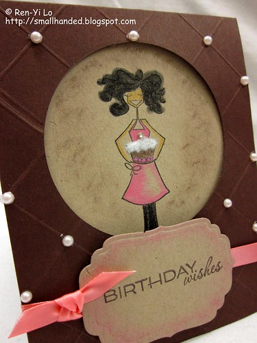

Birthday Wishes
Stamps: cakeabella (Stamping Bella); Fancy Phrases, Very Vintage Labels No. 4 (Waltzingmouse Stamps)
Paper: Paper Basics Card Stock - Dark Chocolate, Kraft (Papertrey Ink)

Ink: Earth Elements - Chocolate Chip (Stamping Up!); Pigment - Black (Colorbox)
Embellishments: Jewel (Memory Box); Creative Candy - Pretty Pearls: pink (Amuse); Nestabilities - Small Labels (Spellbinders); Softcore Colored Pencils - PC942 Yellow Ochre, PC946 Dark Brown, PC929 Pink, PC935 Black (Prismacolor); Double-ended Art Markers - Goldenrod

I'm not sure if this is the bestest, but I wanted to do a birthday card and had someone in mind for this. And it came out the bestest composed card for this very dear person.

I have been itching to make a window card again. So a circle was cut out using my trusty Nestabilities to allow cakebella to peek through. 
The rest of the card is scored in a diamond pattern, and each intersecting line has a little pearl.

Since the candle was hiding I had to add a little bling to bring that out. I also wanted to play with flock again for the cake, and I believe it came out a lot nicer. The key is loads of glue surface. Just when you think you have enough glue, add more for some good measure. And then dump half the flock and squish, squish, squish it together. The more compact, the fluffier, the better!
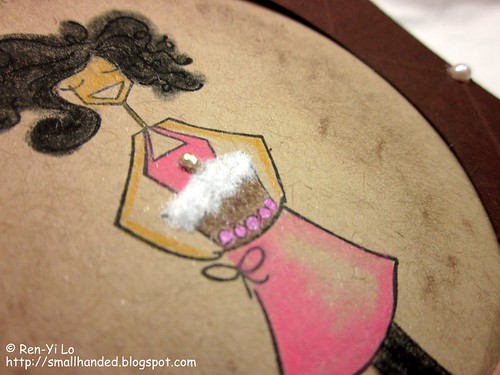

Birthday Wishes

This reminds me of the scene in "Despicable Me" where Agnes says "It's so fluffy, I'm going to die!" If you're giving me blank look, check this youTube clip out. Now do you remember? Wait -- you haven't watched "Despicable Me"? Then why are you still reading this blog post? Go, hurry, run and find the next movie theater and drag your kids - and yes, a must in 3D! You'll be rolling in laughter 'til your sides will ache with stitches.

Anyways - back to the card. Now that I think of it - it's a very girly card. Bling, Pearls and Pink.

So, here is wondering if my entries are worthy of a shot at being the next Bella Baberooni. I certainly had fun pushing myself to try something new. And if not this time, maybe next time!

Saturday, August 21, 2010

Happy Birthday, Little Brother

Happy Birthday, Lil' Bro! My brother isn't really that little anymore. He has graduated college, and is a working man! Part of the big, real world - the kind with bills, a job with benefits, and other fun, new responsibilities. My first response after he broke the great news to everyone at home of his new job was "Have you set up your 401K account?" Poor boy.

Anyways - regardless how grown-up he is, he will always be my little brother. The only difference is that I can gift him a card that isn't PG-13 anymore ;) His true loves? Good food, good beer, anything electronic and gadgety.

So the most appropriate stamp to pull out? Beerafella. In addition, the next Bellarific Friday theme has the following sketch

Birthday cards must be fun and colorful. And while looking through my pattern paper stash, I remember my trusty Cosmos Cricket pad. So, here is what Beerafella & I came up with:

Happy Birthday
Stamps: Beerafella (Stamping Bella), Wonderfully Whimsical (Papertrey Ink)
Paper: Paper Basics Card Stock - White (Papertrey Ink); Boyfriend (Cosmo Cricket); Basic Card Stock - Cream (Recollections)

Ink: Earth Elements - Creamy Caramel, Not Quite Navy (Stamping Up!); Tea Dye Duo - Chamomile (Papertrey Ink), Momento - Summery Sky (Tsukineko)
Embellishments: General Purpose Thread - Grey (Coats & Clark); Flock - White (Stampendous!); Nestabilities - Small Labels (Spellbinders); Softcore Colored Pencils - PC924 Crimson Red, PC911 Olive Green, PC939 Peach, PC1027 Peon Peacock, PC946 Dark Brown (Prismacolor)


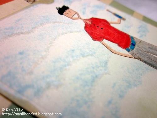
My fun element was to flock the outline of the clouds with my newly acquired flock.

Happy Birthday
Improvements can definitely be made, since the flock looks a little whimpy for the manly card this was suppose to be. More adhesive and loads more compacting down the clouds. But this might quickly become a fun favorite texture embellishment.

Have you played with flock? What are your favorite uses?

Tuesday, August 17, 2010

August Vintage Waltz with Waltzingmouse Stamps

The monthly installment of the Waltzingmouse Blog Waltz is on! Thanks for stopping by! This time the theme is Vintage/Shabby Chic. If you heard a loud groan across the ocean, Lisa & Claire, that was me! Most of the time when people ask me what I do outside of work, I will say paper crafting (signs I'm an addict, since my default answer use to be knitting and crocheting - for my paper crafting friends that read this blog, i hear you snickering and grinning shameless-ly. Shame on you!). The conversation usually stops there, but then in some cases the conversation continues: "Oh lovely, what is your style?" ::dead silence::

I generally glue a bunch of things together and it comes out somewhere between clean & simple, sometimes even with a touch of cute & whimsy. I definitely cannot wrap my head around shabby, and only recently did I try to ink up my card stock or tag edges to create a "light vintage" look - but that too still makes me head hurt. These styles are not intuitive to me.

I read "Vintage Chic" and out came "Whimsy Vintage Chic" (if that even exists) --read on to see how it morphed to this:

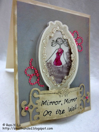
Mirror, Mirror On the Wall...
Stamps: Very Vintage Labels No. 10 (Waltzingmouse Stamps), Victorian Fripperie (Waltzingmouse Stamps), jammybella (Stamping Bella)
Paper: Paper Basics Card Stock - White (Papertrey Ink), Basic Card Stock - White (Recollections), Vellum (?), Pattern Paper - Gray (Memory Box)
Ink: Pigment Ink - Black (Colorbox), Pigment Ink - Gold (Recollections), Brilliance - Black Graphite (Tsukineko), Vintage Touch - Chamomile, Chai (Papertrey Ink)
Embellishments: Rhinestone Stickers (Recollections), Nestabilities - Fancy Tags, Labels Ten (Spellbinders), Double-ended Art Markers - Mulberry, Pink, Warm Grey 50%, Warm Grey 30% (Prismacolor)


Claire has loads of stamps with Vintage in the name, so choosing one of those must be a good first step. Since I was playing with the Label Tens for a previous card, they reminded me of Waltzingmouse's Very Vintage Labels No. 10 -- the first obvious stash choice.  And I have had this obsession that some of the stamps look like mirrors.

Gold and Tans seem to be Vintage 101 elements.  And my newly acquired Fancy Tags also helped as an anchor point for the mirror. The best part was that my Papertrey Ink purchase at CHA could not have been timed better: the Tea Dye Duo set came in super handy to make the card look vintage-y.

The mirror was cut out very carefully using an exacto blade and got a quick outline with a golden sparkly gel pen. This seems to accentuates the gorgeous designs of the mirror frame, and thus a fancy mirror was born. Now for something mirror-worthy to frame ...

jammybella without her jammy pants was perfect to stick into elaborate mirror. With her arms off to the side, and her self-confident expression - perfect for someone who would ask herself "Mirror Mirror on the Wall, Who is the Fairest of them all?" Don't you think? ;) No one needs to know that she has a teddy bear in her other hand and really cute girly jammy pants ...

jammybella is stamped on Vellum, since the sheer texture was mirror-like. I tried to add "smoke" around her since I didn't want her to seem like she was mid-air floating without legs. Too hard to tell from the picture, but the vellum was also backed with a piece of cream card stock that was partially vintaged with Chamomile to add depth.


Mirror, Mirror On the Wall...

Lastly, Chic means Bling, right? ;) I actually decided to give jammybella her pink top and add the pink bling (a dissected flower) around the mirror, because of the hint of pink traces in the gray pattern paper.


The sentiment is unfortunately hand-written, since I didn't have the energy to go  set up the printer. I mimicked Claire's Victorian Alphabet font the best I could. Victorian is after all vintage-y, right?

Well I hope this shed some light on how I pushed the boundaries to come up with something vintage chic. Does it work? Is the bright pink and the vintage paradoxical?

So those that have peeked over here for a while, I'd love to hear what kind of style you would categorize my work. Or is it too early to tell?

Wednesday, August 11, 2010

Presenting Presentahbella

Ever heard of the Bellarific Baberoonis? It's the talented pool of bellarific bellas that help Em showcase her fun & whimsy stamps. My favs are her Bellas and Fellas, but there are plenty of other adorable lines. Just go see for yourself!

They have Bellarific Fridays and is just another fun place to play along. The theme for last Friday was Paper Piecing, and I thought it'd be fun for my Bellas to play along! So out came Presentahbella...


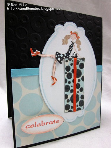
Celebrate
Stamps: Presentahbella (Stamping Bella), Asian Gardens Additions (Waltzingmouse Stamps)
Paper: Paper Basics Card Stock - Black (Papertrey Ink), Paperie Poolside & Greenhouse (Making Memories), Basic Card Stock - White (Recollections)

Ink: Pigment Ink - Black (Colorbox), Earth Elements - Creamy Caramel (Stamping Up!), Perfect Match Pigment Ink - Terracotta (Papertrey Ink)
Embellishments: Kingfisher - Blue (Paperchase), Nestabilities - Labels Ten (Spellbinders), A2 Embossing Folder - Spots & Dots (Provocraft), Softcore Colored Pencils - PC935 Black, PC921 Pale Vermillon, PC927 Light Peach, PC1015 Deco Blue (Prismacolor), Point 88 - Art No. 88/46, Art No. 88/54 (Stabilo), Spool 'o Ribbon - 1/8" Orange (Offray), GellyRoll - Glaze Clear (Sakura)


I thought the circles in the stamp design would be fun to highlight. So I chose a pattern paper with circles. The blue in the pattern paper is subtle enough that it didn't fight with the circles of the stamp. After stamping the present and coloring in the circles, the next neat idea was to make Presentahbella's dress the opposite. A play on positives and negatives, and before you knew it, she was pieced together. Surgery on Presentahbella went well - no accidental amputations - and she quickly regained her color ;) Lastly, the base card stock is embossed with Spots & Dots to keep the circle theme going, which is a little hard to tell in these pictures...

Celebrate
The other fun part was using my newly-acquired-at-CHA Labels Ten! Overall a fun color combination - playful but still chic. Do you have Bellas? If so, which one is your favorite?

Thursday, July 1, 2010

Birthday Wishes

A guy co-worker was absolutely amused by my card crafting, when I mentioned how much engineering goes into designing and implementing a card - in fact it goes through the same stages of our beloved software engineering cycle. One has to think about the requirements for the card, then create a design that support the aforementioned requirements, and then execute the implementation, as well as test the card for robustness and quality.

Since his mother's birthday was around the corner, he then gave me an order to make a card. With nothing to go by (e.g., her favorite color, her preference for serious or whimsical), I had to use something to base my design on.

So I went with my trusty Stamping Bellas. Who doesn't like them?! And went to go find a sketch to get me-self some extra practice. Since I was ahead of the game and got my weekly Waltzingmouse Sketch done, I was skimming the vast world of sketches out there. It was suddenly when I remembered the sweet, sweet memory of my first stamp sets I ever owned. I bought them at my first introduction to paper crafting at a Stamping Around workshop, where I also met the talented, spunky and wonderful Korin Sutherland. I was immediately smitten by her. So I hopped over there and discovered the Sweet Stop Sketch blog. Why didn't I check this out earlier?! Silly me. And look what a fun sketch I found...

So without further ado, here is the birthday card for a co-worker's mom. I hope she likes it and that I didn't choose colors that she did not like.

Birthday Wishes Card
Stamps: cakebella (Stamping Bella), Asian Gardens (Waltzingmouse Stamps)
Paper: Paper Basics Card Stock - Kraft (Papertrey Ink), Basic Card Stock - Cream  (Recollections), Urban Prairie (Basic Grey), Oasis (sei)
Ink: Perfect Match Pigment Ink - Hawaiian Shore (Papertrey Ink), Brilliance - Pearlescent Coral (Tsukineko), Pigment Ink - Black (Colorbox)
Embellishments: Corner Punch (EK Success), Border Punch - Apron Lace (Fiskars), Vintage Button Collection - Spring Mix (Papertrey Ink), Frosting Flowers Floraux de Fleur (Prima Flowers), Hemp Cord (Darice), Ribbon - Turquoise/Magenta Plaid (Michael's), Softcore Colored Pencils - PC929 Rose, PC946 Dark Brown, PC1002 Yellowed Orange, PC939 Peach, PC1052 Warm Grey 30%, PC905 Aquamarine (Prismacolor), Odorless Mineral Spirits (Gamsol)

I colored my cakebella to match the rest of the card's color theme. This card was also created with the recent PTI package that had arrived. Working with amazingly thick card stock makes such a big difference. My card stands -- all on its own -- just thoroughly amused by this little fact :)

So on a more amused note, this card will be traveling internationally. I hope the recipient is delighted by it.

Sunday, March 7, 2010

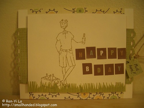
[Stamping Around] SA04 - Waltzingmouse Stamp Challenge: Happy Birthday

One of my dear, trans-atlantic friends was having a birthday and even though he was visiting the US, our schedules didn't line up for a quick weekend catch-up (Yes, I'm still traveling 75% to 100% of my time). But this weekend I promised myself that I had to make the time to craft in my new craft room. To top it all off, my girlfriend encouraged me to try a challenge. So, this post covers many first: crafting in my craft room, inking up my first Bella Stamps, going for a challenge, and trying out a new technique -- heat embossing!

Stamping Around WMS Challenge
Stamps: beerfella (Stamping Bella)
Paper: Beige (Recollections), Earth Love (Cosmo Cricket), Everyday Brown Kit (Marcella K), scrap green
Ink: Embossing Stamp Pad (Martha Stewart), Antique Gold Embossing Powder (Martha Stewart), Brown Pen Art No. 88/45 (Stabilo)
Embellishments: Jute Packaging Twine (Westrim Crafts
), Everyday Brown Kit Stickers (Marcella K), Apron Lace Border Punch (Fiskars)

The card's color scheme is based on this month's Stamping Around challenge hosted by Waltzing Mouse. Since I'm such a fan of her stamps -- why not try for a fun prize?


I bought my friend a gift card to Barnes & Nobles, since he loves his books & Starbucks coffee. Inspired by Belinda's gift cards, I took her concept and tried to build a card around the color challenge.

This card came together with a few of my personal requirements: I wanted to create a boy card given the color challenge (tough!), ink up my Stamping Bella stamps (so that I could finally use my clear mount), and try heat embossing. 

I decided to stamp the image in the antique gold, rather than the black, to preserve the neutral colors called for in the challenge. The challenge also called for pale yellows and pale pinks, which is hard to fulfill with a boy card. However, I found the Cosmo Cricket paper in my stash, which could fulfill that part. Let's hope that the WMS gals are lenient ;) Early on, I pulled a green paper from the Everyday Brown Kit, that I wanted to use in this card. The stickers from the same kit looked manly enough to spell out "Happy Bday", which conveniently also had some red/pink tones in the letters. With a whimsical arrangement of the letters, the front was almost complete. The rest fell together: a little twine to attach a hand-scribbled "Pull Here" note, a little bit of self-made grass trim from a scrap pile for the beerfella to stand on, and a bit more of the Cosmo Cricket paper on the inside sleeve to tie the whole theme together.

Stamping Around WMS Challenge

I had to actually fudge the card holder, since I didn't have a punch to make the nice semi-circle punch. But I wasn't going to leave that fact stop me from creating a gift card holder, so I whipped out my trusty old X-acto knife and cut out a pre-traced out my semi-circle.

I hope you liked my little birthday card. It was a real treat for me to get back to crafting. Hopefully I won't be living on the road so much longer, since I'm not as daring to get my Crop-a-dile pass security as some others are...
Related Posts with Thumbnails