Showing posts with label miss you. Show all posts

Thursday, May 31, 2012

[DYSU] Challenge #74 - Under the Sea

Good morning, everyone! Summer is really coming around - evident by the hot temperature. Makes me want to jump into a nice cool pool or hang out in the ocean. It's Beach Time after all...(although I'm not a big fan of all the sand)

So you know we had a DT call at DYSU, right? The new girls have all been notified but announcements don't go out officially until June 1st. Here a quick schedule of what's going on at DYSU...

  • Jun 01 - see who made the cut into our DYSU 2012 Term 2 Team
  • Jun 06 - Top Three & Winners post for #74
  • Jun 07 - last challenge for some of our current DT
  • Jun 10 - Goodbye & Hellos, including an introduction of the entire DYSU 2012 Term 2 Team
  • and then the normal fun resumes with the new team... 
Are you excited? We are for sure...But to tie you over until all this excitement goes live...we are breaking those record heat waves with a theme called Under the Sea. Yep - this one brought back memories of "The Little Mermaid." Some of you may know how susceptible I get to hearing songs in my head ;)


What a cooling picture, isn't it? This week I'm showcasing a Sweet 'n Sassy Stamps digi.  Sweet 'n Sassy is one of my first love and my first stamps ever purchased. I even got to meet Korin the wonderful brain behind Sweet 'n Sassy Stamps before I even knew I was addicted to paper crafting and stamping ;)
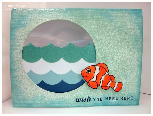
Wish You Were Here
Stamps: (Clownfish) Sweet 'n Sassy Stamps; (Roadtrip) Papertrey Ink
Paper: (Paper Basics Card Stock - Vintage Cream) Papertrey Ink; (Heatwave) American Crafts
Ink: (Tim Holtz Distress Inks - Tumbled Glass; Jenni Bowlin - No. 9 Spice Tin) Ranger
Embellishments: (Impression Plate - Woodgrain) Papertrey; (Liquid Pearls - White Opal) Ranger; (Soft-core Color Pencils) Prismacolor; (Mister Huey - Lunchtray) Studio Calico; (Nestabilities - Standard Circles Small) Spellbinders; (Acetate)


I decided to emboss the base card stock with an Woodgrain Impression plate of texture. If you look at woodgraind side ways it looks a little like those patterns that carved into the sand by the water. Fun & wavy...Added a bit of Distress Ink on the side, and didn't like how "white" it still looked. So I took some misting to it. After all fishes swim in water, and no on the white beach sand... ;)

Next I colored this little cute Clownfish. I gave him a little makeover, because the fin had to be orange, but the stripes didn't play in my favor. I hope Korin doesn't mind. He is also dressed up with some Liquid Pearls for some extra sheen.
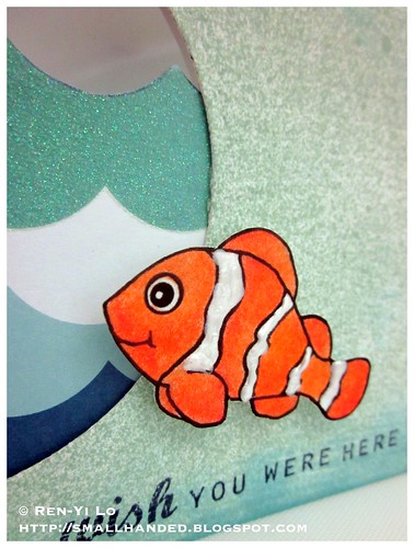

Wish You Were Here

The rest of the background is created by cutting a window out, cutting a piece of pattern paper from my very old Heatwave pattern paper, and adding some acetate to cover it up...I just noticed that you can see my reflection in the background taking the pic. Ha!

The sentiment is inspired by the word "fish." It ways makes me think of "wish." Fish-wish-fish-wish-fish-wish...see how fun that is to say? I bet every time you see a fish, you'll think of some "wishing sentiment" now too...
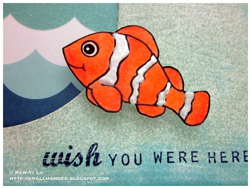

Wish You Were Here

So that's all I have for you today. Go check out the amazing creations by the talented DT and welcome our guest designer. I look forward to seeing your sea creations!

Our sponsors this week:

* $10 Gift Certificate 


* Winner’s Choice of 3 Digis


* $15 Gift Certificate

Tuesday, March 29, 2011

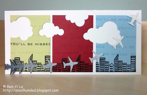
You'll Be Missed

Embellish Magazine Challenge is one my favorite challenges to partake in, because it pushes my boundaries when it comes to themes & color combos. I'm not a bold, colorful person, and tend to grab blacks, krafts, browns, whites and let the stamping, pattern paper, or color penciling do the color-talking. Anyone else out there feel the same? So this week, Embellish is challenging me to two areas: masculine cards (arg!) and colors.


Another fun challenge that is going on this week is happening on Jenny's blog. The WeeMemories team is sponsored by My Favorite Things, one of many companies whose stamps I adore. This doesn't get any easier, since the theme this week is:
The tricky part for the creation process was wrapping my head around blues, green and red as "masculine" colors prescribed in the Embellish Magazine Challenge. I get the gray and blue, but the red was way too cheery.

You know what I really liked the most of this challenge? The visual poster - two weeks ago you heard me swoon about the macarons; this week you'll hear me swoon about planes. Ashley sure knows how to put these posters together, right? I fly a lot and often find myself living at the airport (for better or for worst) for the past two years or so. The best parts are sitting at the gate and watching planes land and take off. It's quite fascinating to see all the operations go back and forth - the lil truck that pushes the plane from the gate back, the dudes with their glowing sticks to help navigate the plane in and out of the gate, the baggage wagon zooming back and forth. Perhaps I should have been an aerospace engineer or a flight controller. But alas, I detract.

What I meant to say is that this card was inspired by my loads of travel and my joy in finally being able to use my impulse purchase. Yes, I picked up the little airplane punch at Michael's about half a year ago and it hasn't made a debut on any projects yet - hey, it was on sale for $2 and better late than never ;)


You'll Be Missed
Stamps: (Goin' Places) My Favorite Things; (Free Spirit - Sentiment) Waltzingmouse Stamps
Paper: (Paper Basics Card Stock - Spring Moss, Spring Rain, White) Papertrey Ink; (Key Ingredients Kit - Winnie's Walls) Taylored Expressions
Ink: (Memento - Tuxedo Black; Versamark) Tsukineko

Embellishments: (Steel Dies - Cloud 1 & 2 Die Collection) Papertrey Ink; (Airplane Medium Punch) EKSuccess; (Embossing Powder - Ebony) Martha Stewart; (Double-ended Art Markers - Cool Greys) Prismacolor

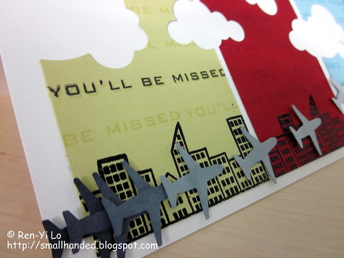
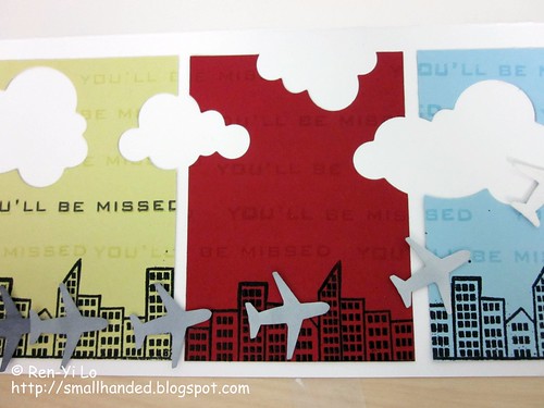
I started punching out nine little planes and colored them in a monochromatic gray from 90% cool gray up to 10% cool gray. I knew that I wanted to play around with layering them and making it look like a plane was taking off into the sky - exactly against what background, I was still unsure.

You'll Be Missed

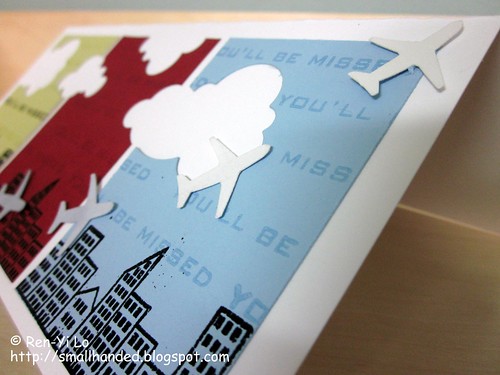
Then I remembered that I had to incorporate fun colors and what better way of utilizing these fun, bold colors by breaking in some negative space in the form of clouds? Planes live in skies which have lots of clouds...

You'll Be Missed

It still looked empty at this point and then I remembered I had a fun city scape in My Favorite Things "Goin' Places" stamp set. A little embossing action and a city skyline was quickly created - easy peasy.

You'll Be Missed

That's when I realized I needed to add a sentiment - preferably masculine looking. The "Bon Voyage" sentiment was too cursive for my taste, so I pulled out my handy-dandy and trusty Waltzingmouse "Free Spirit - Sentiments" to make it work. I actually could not find a fitting sentiment for what I was looking for and was about to pull another set out, when a bunch of lightbulbs lit up in my head. You see, I was thinking "How sad, I'm not sure where the little jet plane is flying to..." when it occurred to me, this card is perfect for when someone leaves...and I have plenty of friends that keep leaving the area to venture into other jobs or they go back to their home countries.

If you made it this far - kudos to you reading my ramblings. Hope you like this little card. As you can tell, when I create cards, I often don't have the entire card designed out. I let myself be inspired by my stash. Also, sometimes that perfect sentiment is exactly not the one I had in mind and "making it work" often forces me to think outside the box.

So, what kinds of cards throws you out of your comfort zone?
Related Posts with Thumbnails