...my friend there is always time for you. That's the sentiment of today's card that I have for you. I decided it was time to make a card for my all-time favorite sketch challenge... Waltzingmouse Sketch Challenge. Easy enough, right? A few panels and we're good to go...
So here is a card using my much beloved Afternoon Tea set...
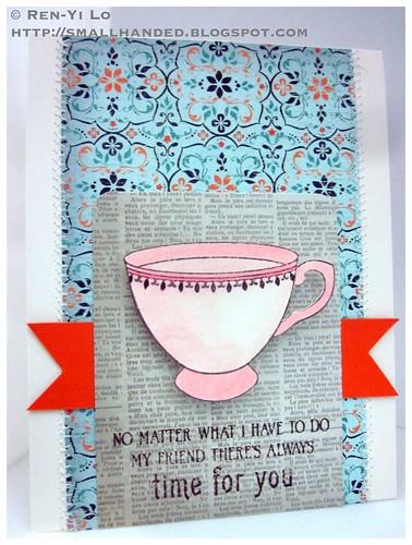 Stamps: (Afternoon Tea Sentiments) Waltzingmouse Stamps;
Paper: (Paper Basics Card Stock - Vintage Cream, Orange Zest) Papertrey Ink; (Lost & Found - Portobello Road) My Mind's Eye; (Gathering) Authentique
Ink: (Jenni Bowlin - No. 11 Brown Sugar) Ranger
Embellishments: (Soft-core Color Pencils) Prismacolor; (White Thread) Gütermann; (Corner Chomper - 1/4") We R Memory Keepers
As inspiration I decided to check out what Embellish was up to this forth night...
Tea! I thought that was a weird coincidence...maybe I had seen this a while back and it was in my subconscious, but who knows?! I combined the colors from this fantastic poster with the above sketch...
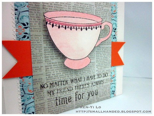 Love little pink porcelain tea cups... :) Anyways, thanks for peeking. I love it when I get to make a card for myself...it's a small luxury that I truly enjoy. Happy Weekend...
Hello everyone! It has been a while since I have gotten around to be able to submit a card for Embellish challenge. Just a quick post to link this card up :)
These colors really say whimsey too me. I suppose it could have been vintage too, but as usual, I'm in a need of a birthday card and decided to make this more whimsy.
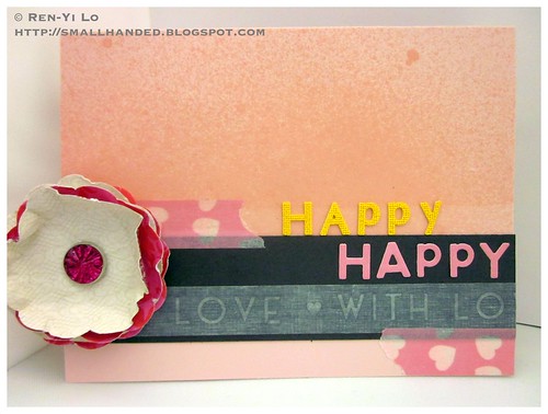 Stamps: N/A
Paper: (Paper Basics Card Stock - Sweet Blush; Damask Designs) Papertrey Ink; (Lost & Found Two - Blush) My Mind's Eye
Ink: (Versamark; Briliance - Pearlescent Sky Blue) Tsukineko; (Perfect Match Pigment Ink - Vintage Cream) Papertrey Ink
Embellishments: (Mixed Brads - Karlie) The Girl's Paperie; (Nestabilities - Big Scalloped Circles Large) Spellbinders; (Mister Huey - Cameo) Studio Calico; (Alphabeans - Pickled Pink) Jillibean Soup; (Washi - With love on Gray Sketch, White Hearts on White) Love My Tapes; (Alphabet Stickers) Prima
I decided to make my own flower embellishment and was set on using the pink rhinestone brad. The whimsey really came together with my new secret combo: mists & washi. Can't go wrong with those ;) Also really wanted to use these fun alphas I found in my stash that were from Prima. They have an interesting cool foam/spongy-like texture. Almost like from a play mat...
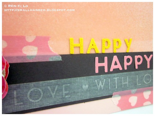 That's all I have for you. Thanks for peeking :) What are you favorite combos for whimsey?
Hello everyone! Here is a quick post for a challenge that I have missed so much. I'm glad the Embellish Gang is back and have put down a color trend challenge. Here is the beautiful challenge poster:
When I saw this poster I immediately thought of the Nantucket collection paper color scheme. I guess it's pretty much a done deal when I have something in my head...I decided to ink up a few of my new Waltzingmouse Stamps for this fun challenge.
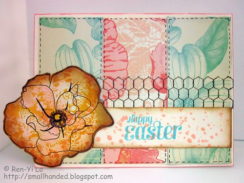 Stamps: (Roses in Bloom, Compact Sentiments, Chicken Wire) Waltzingmouse Stamps
Paper: (Paper Basics Card Stock - Vintage Cream) Papertrey Ink; (Nantucket) Pink Paislee
Ink: (Jenni Bowlin No. 11 - Brown Sugar, No. 14 Speckled Egg, Tim Holtz Distress Inks - Vintage Photo) Ranger; (Ingvild Bolme Chalk Fluid Edger - Rose) Prima
Embellishments: (Soft-core Color Pencils) Prismacolor; (Mister Huey - Cameo) Studio Calico; (Point 88) Stabilo
I decided to give the stamped rose a little more dimension by coloring in some pink and distressing the edge. It also helps dampen the bright yellow that it is. The speckled sentiment draws inspiration from speckled eggs and the name of the Jenni Bowlin ink ("Speckled Egg"). Kinda a fun twist...
 I suppose the chicken wire comes from the inspiration of eggs and chicken... and I secretly just really wanted to ink up that new set :)
Hope this tickles... the DT from Embellish has some amazing inspirations for this challenge. And I am so happy that the team is back!
It's been a while since I had a chance to make something for one of my favorite challenges Embellish Magazine Challenge. When I saw that this challenge revolves around square card, I got all giddy. I love making lil square cards, cause they go so well with a gift.
With the summer nearing, I really loved this sweet little color palette.
At wee Memories this week, they are featuring a challenge called C.R.A.F.T.S. - Use Color, Ribbon, Acrylic, Flowers, Twine and/or Stamps. And because I can't really follow directions to a tee, I used a flower chipboard and some floral pattern paper, tulle instead of ribbon, and a sentiment for my stamps :)
To my dismay, I must have been on some color high. When I pulled out some s.e.i. Mimosa paper, I was so sure there were pink and yellow hues with some bridging into the orange/peach. It even has this beautiful luster to it, but when looking at this picture it really just looks orange and red.
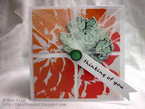 Stamps: (Little Frieda Daisies) The Craft's Meow
Paper: (Paper Basics Card Stock - White) Papertrey Ink; (Mimosa) s.e.i.
Ink: (Jenni Bowlin - No. 11 Brown Sugar) Ranger
Embellishments: (Portrait Collection - Chipboard, Sew Brads) Crate Paper; (Tulle) The Craft's Meow Kit
I absolutely adore the Crate Paper's Portrait Collection - something about that blue hue in that set that makes it just all together perfect.
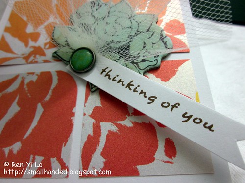 If you look carefully, you can tell that there is this luster on the paper. It's what makes s.e.i. paper so fun. But note to self - check the color palette! I blame it on being out of practice ;)
Embellish Magazine Challenge is one my favorite challenges to partake in, because it pushes my boundaries when it comes to themes & color combos. I'm not a bold, colorful person, and tend to grab blacks, krafts, browns, whites and let the stamping, pattern paper, or color penciling do the color-talking. Anyone else out there feel the same? So this week, Embellish is challenging me to two areas: masculine cards (arg!) and colors.
Another fun challenge that is going on this week is happening on Jenny's blog. The WeeMemories team is sponsored by My Favorite Things, one of many companies whose stamps I adore. This doesn't get any easier, since the theme this week is:
The tricky part for the creation process was wrapping my head around blues, green and red as "masculine" colors prescribed in the Embellish Magazine Challenge. I get the gray and blue, but the red was way too cheery.
You know what I really liked the most of this challenge? The visual poster - two weeks ago you heard me swoon about the macarons; this week you'll hear me swoon about planes. Ashley sure knows how to put these posters together, right? I fly a lot and often find myself living at the airport (for better or for worst) for the past two years or so. The best parts are sitting at the gate and watching planes land and take off. It's quite fascinating to see all the operations go back and forth - the lil truck that pushes the plane from the gate back, the dudes with their glowing sticks to help navigate the plane in and out of the gate, the baggage wagon zooming back and forth. Perhaps I should have been an aerospace engineer or a flight controller. But alas, I detract.
What I meant to say is that this card was inspired by my loads of travel and my joy in finally being able to use my impulse purchase. Yes, I picked up the little airplane punch at Michael's about half a year ago and it hasn't made a debut on any projects yet - hey, it was on sale for $2 and better late than never ;)
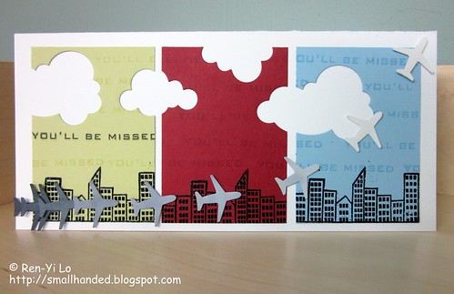 Stamps: (Goin' Places) My Favorite Things; (Free Spirit - Sentiment) Waltzingmouse Stamps
Paper: (Paper Basics Card Stock - Spring Moss, Spring Rain, White) Papertrey Ink; (Key Ingredients Kit - Winnie's Walls) Taylored Expressions
Ink: (Memento - Tuxedo Black; Versamark) Tsukineko
Embellishments: (Steel Dies - Cloud 1 & 2 Die Collection) Papertrey Ink; (Airplane Medium Punch) EKSuccess; (Embossing Powder - Ebony) Martha Stewart; (Double-ended Art Markers - Cool Greys) Prismacolor
I started punching out nine little planes and colored them in a monochromatic gray from 90% cool gray up to 10% cool gray. I knew that I wanted to play around with layering them and making it look like a plane was taking off into the sky - exactly against what background, I was still unsure.
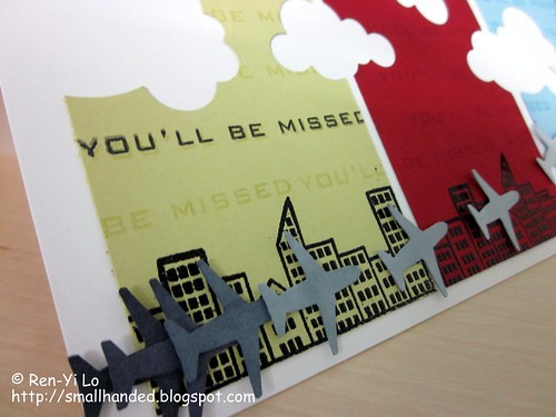 Then I remembered that I had to incorporate fun colors and what better way of utilizing these fun, bold colors by breaking in some negative space in the form of clouds? Planes live in skies which have lots of clouds...
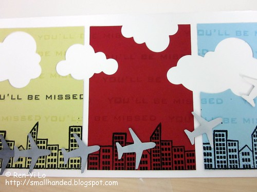 It still looked empty at this point and then I remembered I had a fun city scape in My Favorite Things "Goin' Places" stamp set. A little embossing action and a city skyline was quickly created - easy peasy.
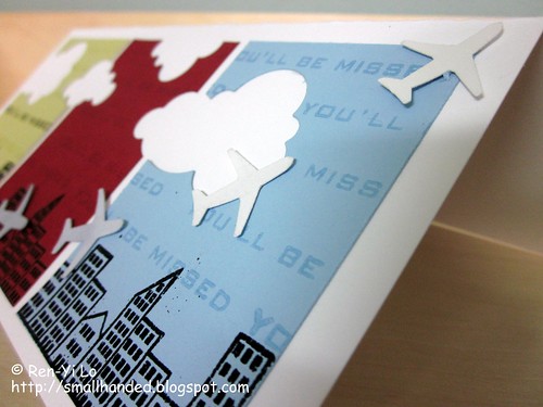 That's when I realized I needed to add a sentiment - preferably masculine looking. The "Bon Voyage" sentiment was too cursive for my taste, so I pulled out my handy-dandy and trusty Waltzingmouse "Free Spirit - Sentiments" to make it work. I actually could not find a fitting sentiment for what I was looking for and was about to pull another set out, when a bunch of lightbulbs lit up in my head. You see, I was thinking "How sad, I'm not sure where the little jet plane is flying to..." when it occurred to me, this card is perfect for when someone leaves...and I have plenty of friends that keep leaving the area to venture into other jobs or they go back to their home countries.
If you made it this far - kudos to you reading my ramblings. Hope you like this little card. As you can tell, when I create cards, I often don't have the entire card designed out. I let myself be inspired by my stash. Also, sometimes that perfect sentiment is exactly not the one I had in mind and "making it work" often forces me to think outside the box.
So, what kinds of cards throws you out of your comfort zone?
Have you seen the latest and greatest Embellish Magazine Challenge? This posted just screams yummy from top to bottom. Two of my favorite things are on this poster: music & food, specifically these yummy macaroons.
This posted brought back a delicious memory of macarons that I had tasted about a year ago in San Francisco. Some of you might know the Ferry Building Market Place in San Francisco. Located inside is the most delightful little bakery and confectionary store called Miette. It is always rather difficult to choose which treat to go for, but in the end the Macarons are my go-to choice. Airy, light in texture, and full of bursting flavor is how i remember them.
Funny enough, I'll be in San Francisco soon enough to attend a wedding, so I might have to swing by and have another delightful bite! In the meantime, here is the aforementioned wedding's card that I have created, using the delicious inspiration mentioned above.
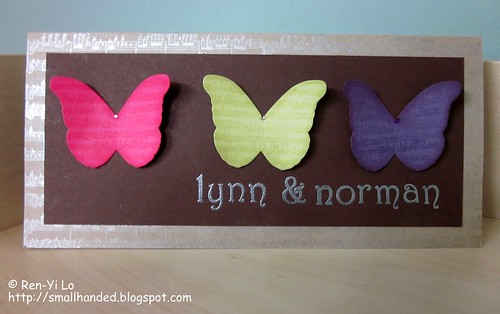 Stamps: (Musical Backgrounds, Victorian Alphabet) Waltzingmouse Stamps
Paper: (Paper Basics Card Stock - Kraft, Dark Chocolate, Raspberry Fizz, Spring Moss, Plum Pudding) Papertrey Ink
Ink: (Perfect Match Pigment Ink - Raspberry Fizz, Spring Moss, Plum Pudding) Papertrey Ink; (Versamark) Tsukineko
Embellishments: (Perfect Pearls - Perfect Pearls, Super Fine Embossing Powder - Silver) Ranger; (Steel Dies - Signature Series: Butterfly ) Papertrey Ink
I stamped on the musical background onto the butterflies and decided to ink the edges of the butterflies with the matching inks. Each butterfly has a little gem in the middle to give it that little finish. Isn't it cute? I like how cheery they look.
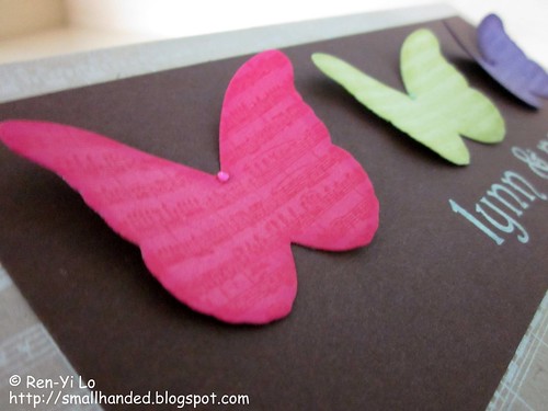 To make the card a tad more special I decided to create a background of more musical notes onto the kraft and dusted with my Perfect Pearl. I love how it looks silvery on the the kraft - a little subtle shimmer to up the elegance on this spring wedding card!
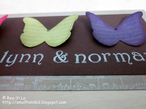 To personalize this card, I decided to heat emboss the couple's name on here. A slow and tedious lining up process, but I'm pretty happy with the way it came out. I had all these nightmare of it turning out crooked and uneven since the brown card stock was horrible to line up.
Just crossing my fingers that the spring wedding pair will love it. If not, I'll go drown my misery in a Macaron ;) Do you have special memories of certain foods from your travels? If so, what are they?
Another fun installment is being hosted at the Embellish Magazine Blog! And some changes to the DT are occurring. This will be the last challenge where we get to be inspired by Maile Belle's work on Embellish. It's really bitter sweet, since I really enjoy seeing her work here every other week.
However, things can't remain the same, if we want to allow for growth. Right? This opportunity allows for new talent to be spotlighted and Ashley has a great eye for picking the right gals! Cristina K has joined the team and I remember seeing many of her creations at the Embellish challenges - either as a winning design or a "What's Hot" spotlight. So I feel so lucky to be able to stalk her work now on a bi-weekly basis.
So I would like to dedicate this card's creation to Maile Belle.
This week I whipped my rather dusty Inkadinkado stamps out, that I used for a Christmas project back in 2009. The colors came together pretty quickly for me, especially cause I had enough foresight to purchase Mister Huey in a beautiful blue hue (Lunchtray). No questions asked - it had to fit in there somehow! I also had a toothbrush box (saved from a trip to Bangalore in 2008 - one can never have enough toothbrushes for cleaning or crafting!) made out of corrugated material. I have always found the texture fascinating and wanted to do something with it. Here is the card in a nutshell:
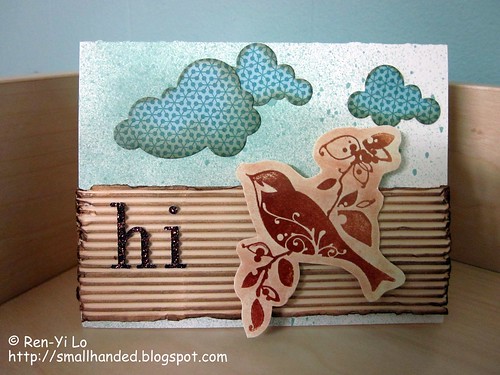 Stamps: (Birds Galore) Inkadinkado
Paper: (Paper Basics Card Stock - Vintage Cream) Papertrey Ink; (Basic Card Stock - Cream) Recollections; (Offbeat) Basic Grey
Ink: (Tea Dye Duo - Chai) Papertrey Ink
Embellishments: (Perfect Pearls - Perfect Bronze, Perfect Copper, Distressed Inks - Vintage Photo) Ranger; (Steel Dies - Cloud 1 & 2 Die Collection; ) Papertrey Ink; (Mister Huey - Lunchtray) Studio Calico; (Glitter Stickers - Bronze) K&Company; (recycled corrugated box for toothbrush)
I initially had this idea of using the corrugated cardboard as tree bark, and started inking it up with Vintage Photo. I liked the distressed look on the edged and went to emphasize the uneven edges with my finger nail. (Super cool technique I learned from watching the talented Ashley in one of her Wednesday Tutorials.) The sky was created by playing with Mister Huey and I went for an uneven coverage - heavier on the left, lighter on the right.
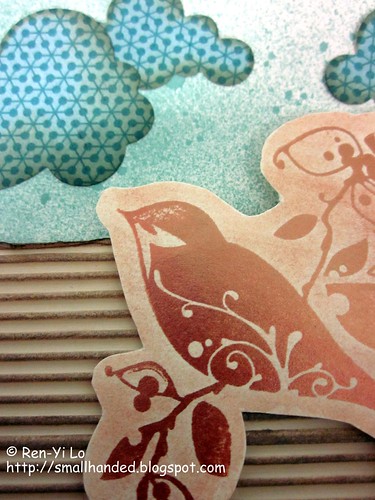 I found a fun scrap piece of Basic Grey paper and knew I wanted to create some fun clouds with the pattern paper. Since I wanted to give the clouds some dimensions I swabbed some edges with my Papertrey Chai cube. This also blended the blue in better for the entire card's design - which was becoming more and more vintage-y. My bird was "colored" using Ranger Perfect Pearls. It has a gorgeous Copper and Bronze finish that shimmers in real life. The photo capture doesn't do it justice.
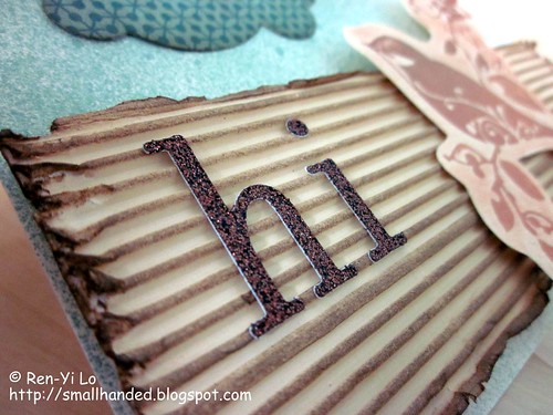 After playing around with some placement I opted to stick two letters from my leftover alpha stickers - that were conveniently available in the awesome shade of brown! Perfect for this challenge.
I was pleasantly pleased with this card, since it fell outside of my comfort zone. And I loads of fun creating this one! Will you be playing along?
I was really excited when Ashley and crew started up their Embellish Challenge, so I made a point to get creative. Their posters are always so inspiring - super fun and fresh communication design style, don't you think?
So my idea & implementation design is centered around using felt for the hearts - who doesn't love warm, fuzzy hearts with all this snow still lying around? Why I haven't joined the felt trend earlier, is beyond me. But last year when I made my Chinese Kraft Box orders from Dudley & Tyler, I also bought an assortment of felt from them. I have only cut four little hearts into four corners of felt, so I am not ready to assess how I feel about their felt product.
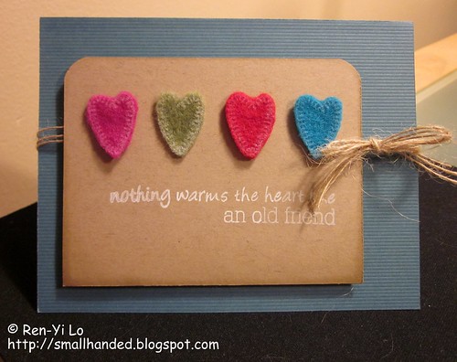 Stamps: (Sewing Box Hugs) Waltzingmouse Stamps;
Paper: (Lucky Teal Cards & Envelopes) Creative Imaginations; (Paper Basics Card Stock - Kraft) Papertrey Ink
Ink: (Perfect Match Pigment Ink - Fresh Snow; Tea Dye Duo - Chamomile, Chai) Papertrey Ink
Embellishments: (Rustic Button Twine - Jute) Papertrey Ink; (Rainbow Classic Felt - Red, Peacock, Fuchsia, Olive) Kunin Group
I don't have enough inking on felt experience, so some hearts didn't show the white as well as other. But I noticed the longer I left my acrylic block with ink on the felt, it showed up better.
 So far, what I really like about Kunin felt is that it is eco-friendly and easy to cut with scissors. I haven't had a chance to run it through my Big Kick yet, so I will report back when I have done that :) The other brand for felt that I wanted to try is Papertrey Ink. They have felt that would match beautifully to my card stock and some inks. What are your favorite brands for felt that you can swear by?
So, when Santa checks his "nice" list, will you be on it? And what are you wishing for? I remember how one Christmas I was wishing for a huge set of color pencils. The kind with 3 tiers in a wooden drawers. Needless to say, it cost a fortune and the little third-grader Ren-Yi was no where near an amateur artist ;) But I digress...
I wanted to share my Embellish challenge card contribution for this week:
I also combined the color with this week's deNami sketch challenge
My Christmas memories inspired me to pull my Around Christmas Time stamp set out. And they were in my recent Waltzingmouse Stamp order which naturally meant they had to be acquainted with my ink pads.
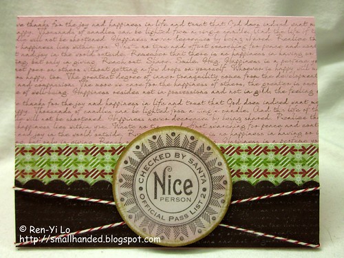 Stamps: (Text It, Around Christmas Time) Waltzingmouse Stamps;
Paper: (Paper Basics Card Stock - Dark Chocolate) Papertrey Ink; (Basic Card Stock - White) Recollections; (Key Ingredients Kit - Penelope's Potpurri) Taylored Expressions; (Eskimo Kisses) Basic Grey
Ink: (Brilliance - Pearlescent Orchid) Tsukineko; (Earth Elements - Chocolate Chip, Close to Cocoa) Stamping Up!; (Distress Ink - Sugar Spun) Ranger; (Tea Dye Duo - Chai) Papertrey Ink
Embellishments: (Baker's Twine - Poppy Red) Papertrey Ink
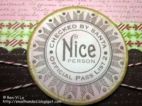
I inked up a text background with brown on pink and decided that the brown card stock was too stark. To soften it up, I inverted and added Brilliance Pearlescent Orchid onto brown. The picture below shows this better...
 In addition I have been meaning to add Tim Holtz Distress Inks to my collection and have recently ordered four fun colors (mainly inspired by Claire): Antique Linen (I wonder why!), Walnut Stain, Chipped Sapphire, and Sugar Spun. Here the Sugar Spun in action...
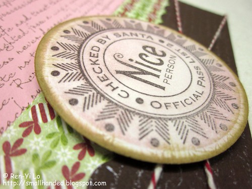 I love, Love, LOVE my new inks. And I can't really explain why it took me this long to try 'em. In fact, love them so much that I am starting to eye other colors...What are your favorite shades of distress ink?
I have been dragging my feet with the next Embellish Challenge. Yours truly has been in love with the idea of felt on cards, but never ventured out to purchase any. And between many business trips and visitors coming, I haven't had a chance to stop by my local Michael's. I already gave up and decided this was one of those inevitable challenges that I will have to skip. And aren't the colors fun and bright?
Then last night I was thinking of all my work-in-progress projects and how I should really dig a few out and finish, preferably before the end of the year. My running list includes unfinished applique stockings, a scarf (oh wait - two scarfs!), three baby blankets, two afghans, a skirt, and several cross-stitching projects. Here is one of those items that needs finishing:
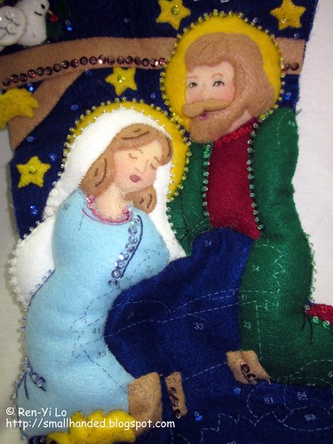 I was perusing through blogs in the comfort my bed, when I jumped out and ran over to my applique bag. It was not the sudden will to finish a WIP - it can wait 'til tomorrow. The applique bag that was stashed and shoved behind a mountain of yarn contained precious glorious felt - yes the same stuff that was in the next Embellish challenge!
So I was eager to leave work on time to knock out a card. Especially with this tweet that came into my feed today
"You still have ALL day to create something and submit it for the Felt Color Challenge! Embellish your creativity..."
It's like one of those fortune cookie messages taunting you ... I had an inspiration to create a bird tweeting "happy birthday!" and using the brown with my woodgrain impression plate. So from that idea, this little darling birdie was born:
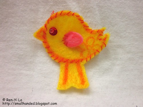 The bird is composed of yellow felt, red ink, red floss, a little red sequin with a clear bead, and a little pink wing. Here the card in full:
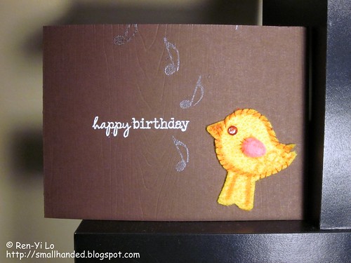 Stamps: Snag 'em - For Peep's Sake (imaginisce); Musical Backgrounds, Half-pint Heroes (Waltzingmouse Stamps)
Paper: Paper Basics Card Stock - Dark Chocolate (Papertrey Ink)
Ink: Pigment - Red (Recollections); Versamark, Brilliance - Pearlescent Yellow (Tsukineko)
Embellishments: Impression Plate - Woodgrain (Papertrey Ink); Stamp 'n Stuff Embossing Powder - White, Detail Clear (Stampendous!); Red Floss, Felt, Red Sequin, Clear Bead, Pink Felt (Stash)
I could not get the woodgrain texture to photograph too well, but here is a different angle. The musical note is actually embossed in clear and stamped with Brilliance ink to give it that little shimmer. I like the effect, but I am too fond where I placed the musical notes.
 So what items were you able to dig out of your stash to "Save the day"?
Have you seen the new Waltzingmouse Stamps October Release? I'm terribly excited. Can't tell you how truly tickled I am with what Claire has been revealing. And her amazing Design Team have been showing eye candy that's drool-worthy. My ultimate dream would be to design just once for Claire. She is one talented woman! Already making my list...and I just put in an order that includes some of the September Release. Greedy, greedy...
So to tie me over I moseyed on over to the Waltzingmouse Sketch Challenge. Look at that - doesn't the stamp scream "background stamping?
I have been thinking of the Embellish Background challenge for a while now and did not get around to it during the first week. Here the details:
To be honest, I was really stumped about the color combinations. The only things that came to mind was "bees, wasps, taxis, construction signs." Finally I conceded and pulled out some cute bees from the Unity + Cosmo Cricket's Garden Variety stamp set and created a cute good luck card. A friend of mine has started law school and I thought the bees would be a perfect reminder of what a determined, hard worker she is. She will be great!
 Stamps: Garden Variety (Cosmo Cricket + Unity); Fancy Phrases, Pic-nic Patterns (Waltzingmouse Stamps)
Paper: Paper Basics Card Stock - Smokey Shadow (Papertrey Ink); Basic Card Stock - White (Recollections)
Ink: Brilliance - Pearlescent Yellow (Tsukineko); Pigment Ink - Black (Colorbox); Perfect Match Pigment Ink - Fresh Snow (Papertrey Ink)
The backgrounds in Pic-nic Patterns are truly wonderful. I love, love the little intersection design. And the background pattern is always generously large, that one only has to concentrate on lining up the bottom line. I am really pleased on how seamless / perfect it has come out. I'm usually one that will not line things up properly, smear ink onto the card stock, or drop my inked block accidentally right onto the card. If Snow White were auditioning for an eight dwarf, I could fit the bill for Clumsy.
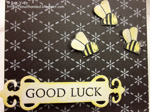 I hope the bees bring luck and spur on hard work & preserverance :) In the meantime, I'm in a hurry to go check out the Waltzingmouse Stamps' Day 2 Sneak Peeks. Won't you join me?