I attended my first Indian wedding this past weekend. It was very exciting, since I was not familiar with the rituals and steps. The priest that they selected was perfect, since he explained everything in English to many unfamiliar with the ceremony. The wedding couple was very gorgeous (I'll post a picture if I get permission :)
So the wedding card was inspired by the next Waltzingmouse Sketch Challenge and their wedding invitation.
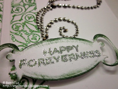
The wedding invitation were very elaborate and beautiful, with a color scheme of silver and green.
Stamps: Victorian Fripperie, Fancy Phrases (Waltzingmouse Stamps)
Paper: Paper Basics Card Stock - White (Papertrey Ink); Basic Card Stock - White (Recollections)
Ink: Earth Elements - Garden Green (Stamping Up!)
Embellishments: Embossing Powder - Evergreen (Martha Stewart); Essential Colors Glitter Set - Sterling (Martha Stewart); Say it With Crystals (Prima)
A close up for the sentiment that spells out "Happy Foreverness" and the heat embossed pattern in the background.
Isn't that a cute sentiment?!
Wednesday, September 29, 2010
Friday, September 24, 2010
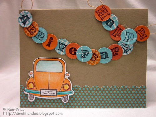
Happy Anniversary
Big shout out to Joni for winning the first "Pagerize" challenge. She gets bragging rights, next pagerize creator, and rights to pick the next winner. So come play along on Scrap Our Stash Challenges. The inspiration page that Joni has created is located here.
Isn't it cute? Things that struck me were:
Stamps: Enjoy the Ride (Papertrey Ink); Pattern Alphabet & Numbers (Creative Clear Stamps)
Paper: Paper Basics Card Stock - Kraft (Papertrey Ink); Key Ingredient Kit - Petals & Paisley (Taylored Expressions); Offbeat (Basic Grey); Classical Botanical (Martha Stewart); various Scrap
Ink: Perfect Match Pigment Ink - Orange Zest (Papertrey Ink); Earth Elements - Chocolate Chip (Stamping Up!)
Embellishments: Rustic Button Twine - Jute (Papertrey Ink); Nestabilities - Standards Circle Small (Spellbinders); Softcore Colored Pencil (Prismacolor)
I tried a twist on creating a banner, but instead of the cute triangles, I opted for little round circles. Here is hoping that there was enough adhesive to adhere them to the twine.
This card also fulfills another challenge that I wanted to par-take in for a long, long while. Actually, I stumbled across this via the very vibrant Vera (like that use of alliteration?), who I met at CHA this year. She serves as a DT Darling for wee Memories. And with such a cute name - how can one say "no" to that challenge? Alas, amongst all the on-going business trips I am finally getting to squeeze it in there and really tickled that I get to play!
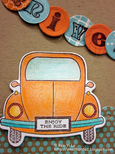
The theme is "Scallops, Orange, and String" - pick two. If I incorporate all three, do I get extra credit? ;) Here is a close up of the Orange-goodness and a wee scallop in the background.
Well, that's all folks. I'm off to a Indian wedding this weekend (so excited - never been to one) - so I'll have a wedding card to post in the next few days.
Isn't it cute? Things that struck me were:
- Bright, fresh colors - orange and ocean blue/teal
- polka dot paper
- border punches
- the fun sentiment placement (vertical & horizontal)
Stamps: Enjoy the Ride (Papertrey Ink); Pattern Alphabet & Numbers (Creative Clear Stamps)
Paper: Paper Basics Card Stock - Kraft (Papertrey Ink); Key Ingredient Kit - Petals & Paisley (Taylored Expressions); Offbeat (Basic Grey); Classical Botanical (Martha Stewart); various Scrap
Ink: Perfect Match Pigment Ink - Orange Zest (Papertrey Ink); Earth Elements - Chocolate Chip (Stamping Up!)
Embellishments: Rustic Button Twine - Jute (Papertrey Ink); Nestabilities - Standards Circle Small (Spellbinders); Softcore Colored Pencil (Prismacolor)
I tried a twist on creating a banner, but instead of the cute triangles, I opted for little round circles. Here is hoping that there was enough adhesive to adhere them to the twine.
This card also fulfills another challenge that I wanted to par-take in for a long, long while. Actually, I stumbled across this via the very vibrant Vera (like that use of alliteration?), who I met at CHA this year. She serves as a DT Darling for wee Memories. And with such a cute name - how can one say "no" to that challenge? Alas, amongst all the on-going business trips I am finally getting to squeeze it in there and really tickled that I get to play!
The theme is "Scallops, Orange, and String" - pick two. If I incorporate all three, do I get extra credit? ;) Here is a close up of the Orange-goodness and a wee scallop in the background.
Well, that's all folks. I'm off to a Indian wedding this weekend (so excited - never been to one) - so I'll have a wedding card to post in the next few days.
Thursday, September 23, 2010
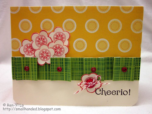
Cheerio!
I am have been so under the weather. You remember that Nyquil ad? The "nighttime sniffling sneezing coughing aching stuffy head fever so you can rest medicine" pretty much summed it up.
But that's not going to deter one crazy stamper from pushing something out for the next Waltzingmouse Sketch Challenge
Besides I know someone right now is going through more than I am. A new work acquaintance was in the hospital recently for something unexpected, so she needed a fun, bright card to cheer me up. And making one makes me happy too - enough to make me forget I was sick.
Stamps: Fancy Phrases (Waltzingmouse Stamps)
Paper: Basic Card Stock - Cream (Recollections); Garden Variety (Cosmo Cricket)
Ink: Pigment Ink - Black (Colorbox); Earth Elements - Ruby Red (Stamping Up!)
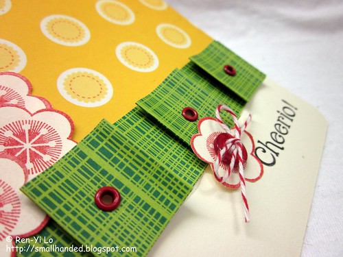
Embellishments: Baker's Twine - Red Poppy (Papertrey Ink); Vintage Buttons - Pure Poppy (Papertrey Ink); 1/8" Circle Eyelets Multipack - Red (Making Memories)
I opted to paper pleat across the card, but chose one of those inverted pleats so that little squares show up. Gives the card a little fun dimension, don't you think?
Well, sick isn't going to deter me from crafting, but it will keep my post short ;) Can't wait to see all the wonderful work of the other ladies.
Labels:
cards,
challenge,
hello,
waltzingmouse sketch,
waltzingmouse stamps
Friday, September 17, 2010
September Halloween Waltz
The monthly installment of the Waltzingmouse Blog Waltz is on! Thanks for stopping by! This time the theme is Halloween. My week whizzed by so quickly, since I spent a good deal last week afterwork and on the weekend shopping with my dear friend for her wedding dress. It was Sunday evening, when I discovered to my horror, that the monthly waltzing engagement fell in my travel week, in addition to the weekly Waltzingmouse Sketch challenge. Sometimes work just gets in the way of all things crafty, doesn't it? ;) Honk Leave a comment if you can relate!
And after returning from a fun High Tea Bridal shower on Sunday, I was not ready to think about graveyards, ghosts and green guts. I was still in heaven from savoring my double clotted cream and raspberry preserves on a warm scone. Some of you might recall my frustration of trying to find double clotted cream in the States. The whole afternoon was certainly very girly.
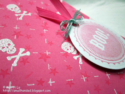
Staring at Wanda's Pantry and Midnight Feast did very little to get my haunt on. So when a girl gets desperate, she just starts crafting. The pink card stock tickled my fancy when I happened to see the deadly skull on Midnight Feast. Perfect: Pink + Skulls = Ode to Paul Frank.
Stamps: Midnight Feast (Waltzingmouse Stamps)
Paper: Paper Basics Card Stock - Hibiscus (Papertrey Ink); Basic Card Stock - White (Recollections)
Ink: Perfect Match Pigment Ink - Fresh Snow, Hibiscus (Papertrey Ink); Versamark (Tsukineko)
Embellishments: Stamp 'n Stuff Embossing Powder - White (Stampendous!); Gelly Roll - White (Sakura); Spool 'n Ribbon 1/4" Ribbon - Pink (Offray); Silver Threading (?)
The skull background was inspired by the Pic-Nic Patterns stamps set. I created my own criss-cross hash and at every intersection there was an embossed skull. The dotted hashes are created with a white gel pen. The star background is watermarked onto the card stock. A round sentiment to tie it all together and I had to call it the day, since a certain someone had to still do laundry and pack for her business trip ;)
I can't wait to see what all the lovely ladies come up with. Loads of inspiration and talent out there!
Thursday, September 16, 2010
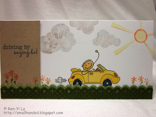
Driving By Saying Hi
I am absolutely thrilled when I received my set of Half-Pint Heroes from Claire. I was a lucky winner and received two random sets in the new September release. I don't know how Claire knew which to send me, but I was so beyond myself when I received my stamps in the mail, that I was jumping up and down like a little kid. My houseguest probably thought I was weird - or he is getting used to my stunts. Half-Pint Heroes are one of my favorites that made my "to purchase" list came.
So what better to show-case my new Waltzingmouse Stamps then to play in the next Waltzingmouse Sketch Challenge? Right...? And I knew I wanted to play with the little car...
My heart almost sank when I saw this sketch, where is my car going to go? But, guess what? If you tilt your held by 90 degrees I have a long enough card to make a road for the car to play.
Stamps: Half-Pint Heroes, Pic-Nic Patterns (Waltzingmouse Stamps); Up, Up & Away (Papertrey Ink)
Paper: Paper Basics Card Stock - White (Papertrey Ink); Dotted Swiss Card Stock - Clover Leaf, Irish Eyes (Bazzill Basics Paper); Urban Prairie (Basic Grey); Textured Basic Card Stock - ? (DCWV?)
Ink: Perfect Match Pigment Ink - Orange Zest (Papertrey Ink); Brilliance - Pearlescent Yellow (Tsukineko); Pigment Ink - Black (Colorbox); Earth Elements - Creamy Caramel (Stamping Up!)
Embellishments: Souffle 3D Opaque Ink - Matte Gray (Sakura); Softcore Colored Pencils - PC946 Dark Brown, PC1003 Spanish Orange, PC942 Yellow Ochre, PC1015 Deco Blue, PC1052 Warm Grey 30%, PC911 Olive Green, PC945 Sienna Brown (Prismacolor); Double-ended Art Markers - Terra Cotta, Crimson Red, Cool Grey 90%, Cool Grey 30% (Prismacolor)
The inception of the green, grassy field was also inspired by the September Border Punch challenge from Scrap Our Stash. In the Waltzingmouse Sketch, there was also a scalloped border that immediately screamed "border punch!" And then I had a vision - sitting in a car zipping past fun fields of flowers and how scenic it was. Those were some of my favorite childhood road trip moments. So converting a scalloped border into a field of green was just "au naturale." I love how I can stretch my border punches to do more than just fancy up a border. Scalloped borders make also good fake water waves...
When I was all done, someone pointed out that I chose my color palette from the next Embellish Paper Piecing challenge. Ha - thank goodness I cut out my yellow bug - that satisfies the Paper Piecing, right?
It is kind of crazy how things sit in my subconscious. Here I intended to meet two challenges, but an additional was satisfied - not by intention. I suppose the orange accents make me deviate from the challenge, just a tad. Maybe when time permits, I will make another one next week, with the Embellish challenge in mind.
Does your subconscious play dirty tricks on you?
Thursday, September 9, 2010
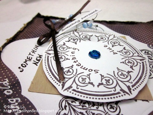
Something Old, Something New...
Something old, something new;
Something borrowed, something blue
And a silver sixpence in her shoe.
One of my fun girlfriends was back in town, and we went bridal shopping for her upcoming wedding. Did I mention she'll be getting married in a castle? So not missing this one, even if it means flying across the pond. Anyways, one fun element when talking about accessorizing for her gown was thinking how she was going to make sure she had herself covered with "something old, new, borrowed and blue." Before you know it, these four elements were repeating themselves in my head - over and over like a rhythmic chant.
So what happens when you add "rhythmic chant" and this visual?
Yup - the fact that there were four layers or elements in the card was the first characteristic that jumped out. And the only characteristic, since I fell into my obsessive design behavior right after that. Four sketch elements - four bridal elements!
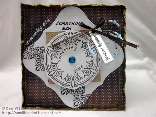
Stamps: Victorian Fripperie (Waltzingmouse Stamps)
Paper: Paper Basics Card Stock - White (Papertrey Ink); Basic Card Stock - White (Recollections); Wausau Crinkles Card Stock - Beige (Creative Collections); Porcelain (Basic Grey)
Ink: Earth Elements - Chocolate Chip (Stamping Up!); Tea Dye Duo - Chai (Papertrey Ink)
Embellishments: Rhinestones (Recollection); Nestabilities - Labels One, Standards Circle Small (Spellbinders); Stamp 'n Stuff Embossing Powder - Detail Clear (Stampendous!); 1/8" Ribbon - Brown (Offray); General Purpose Thread - Beige (Coats & Clark); Double-ended Art Markers - True Blue (Prismacolor); Gelly Roll Classic - White (Sakura); Point 88 - Art No. 88/45 (Stabilo); Hand-made beaded Necklace
The neatest part is that this card made me push my comfort zones. Scrappy cards aren't my thing, but here is how I tried to satisfy the elements:
- Old: inked up the outer layer with my Tea Dye ink; used the sewing machine to run a stitch along the border (since old things tend to need mending?); ran my thumb across the edges of to distress it
- New: chose white, fresh card stock, which symbolizes new; heat embossed with clear on a lace design to give it a (new) shiny look (see picture below for a better close-up shot)
- Borrowed: this one was the brain teaser of the day: i wanted to include something - a pair of earrings (but I don't remember if my girlfriend had her ears pierced) or something personal from my jewelry stash; the "borrowed" is kind of a loose term here, since she may keep this cute necklace. It is hand-made by another dear friend that also knows the bride-to-be, and I have had it and worn it for a while now. I bundled it with some ribbon; ran it through with a tag through a punched hole, and voila - a gift that is detachable. Does it pass for "borrowed"?
So Victorian Fripperie was my obvious choice, since the Bride-to-be has been in love with lace veils, lace dresses, the lacy-vintage look. So what else screams lace? The dimensions of the card was worked backwards based on the circle stamp in the Victorian Fripperie set, since I knew I wanted to end with that beautiful stamp.
And another close up of all the uneven, sloppy hand-written sentiments.
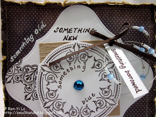
Maybe Claire will take mercy on me and create a sentiment for "Brides-to-be" Best a tongue-in-cheek kind, with a few sweet sentiments in between. Yeah - one of those customers with endless wishes - but one is allowed to wish ;)
What kind of stamp sets do you wish for that you haven't seen out there?
Labels:
cards,
waltzingmouse sketch,
waltzingmouse stamps,
wedding
Wednesday, September 8, 2010
Pagerizing with a "Happy Birthday"
When I heard the word "Pagerize" for the first time in the crafty word, the first thought I had was "virtual or physical paging," but surely this had nothing to do with Operating Systems. Kathy from Scrap our Stash is hosting a new type of challenge called "Pagerize This." Best would be if you hopped over to the challenge blog to read more about "pagerizing."
To be honest, I was a little stumped by this challenge, since Kathy's layout was just so brilliant in so many ways. What I fell in love with was the sequencing of the pictures. So I decided to center my concept on that. Combine that thought with this poster, and an idea starts brewing.
When the latest Embellish challenge called for squares, the concept of panels and sequencing started coming about. The other inspiration actually came from the sponsor's name and logo: Inchie Arts. I had this picture of a caterpillar inching along from panel to panel. But then I realized I didn't have any appropriate images to inch across the panels.
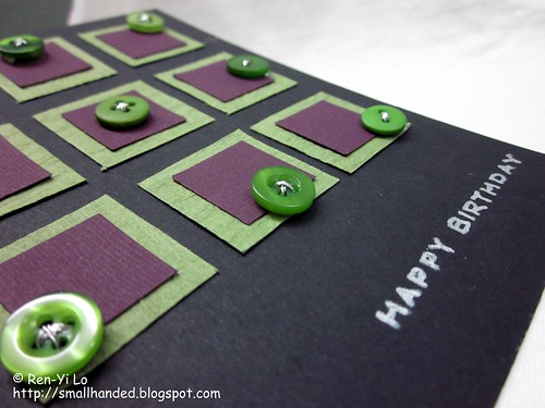
Luckily I had picked out some coordinating materials to fulfill the color portion. I was mindlessly playing with an array of New Leaf Vintage Buttons, when it hit me like an oncoming astroid. And a card was born:
Stamps: Free Spirit - Sentiments (Waltzingmouse Stamps)
Paper: Paper Basics Card Stock - Black (Papertrey Ink); Preppie Pack - Purple (Bazzill Basics Paper); Textured Basic Card Stock - ? (DCWV?)
Ink: Perfect Match Pigment Ink - Fresh Snow (Colorbox)
Embellishments: Gelly Roll Metallic - Silver (Sakura), Vintage Buttons - New Leaf (Papertrey Ink)
For the sentiment, I instinctively grabbed my favorite boy set "Free Spirit," since the recipient was a guy.
To match the silver shiny sentiment, I threaded the buttons with silver twine. Some were four-hole buttons, others are two. Absolutely love how it just came together.
Remember, that for Scrap Our Stash "Pagerize This" challenge there is surprise participation candy to be had! Make sure to click on "Email Me" link on the left pane, if you have submitted your contributions.
Subscribe to:
Posts (Atom)