Note: If you are looking for DYSU Challenge - please keep scrolling :)
Hi there! It's Week 33. How did you do on our last challenge? I spied some lovely creations. It's Labor Day weekend and I intend to take some time off and craft to my heart's content.
If you need something to get you started, we have a fantastic challenge Thank You / Appreciation. A lot of kids are returning to school and it's a great time to appreciate those that are teachers. It's never too early or too late to send a small Thank You token or Appreciation for what they do! Since I don't have any kidlets of my own yet, I made a generic thank you card...
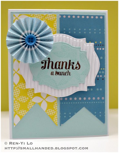
Stamps: (Compact Sentiments, Playful Pinwheels) Waltzingmouse Stamps
Paper: (Paper Basics Card Stock - White, Aqua Mist) Papertrey Ink; (Corrugated Card Stock) gift; () SEI
Ink: (Jenni Bowlin - No. 11 Brown Sugar) Ranger; (Versamark) Tsukineko
Embellishments: (Shoreline Collection: Paper Flowers - Delights ) American Crafts
I really like the idea of dots re-occuring as a pattern: in the blue pattern paper, in the rosette, and in spied the on the fun little Pinwheels set (from Waltzingmouse Stamps). I also thought the pinwheels stamped in Versamark were similar in texture and shapes to the pattern on the yellow-green pattern paper - a good way yo tie everything together.
Hope you like it! Hop on over to see how the rest of the PPC girls used a die! And if you're a regular reader on this blog, don't forget to answer my quick little survey on the top right! Hope you will be playing along with us this week...!
Our sponsor this week:
Thursday, August 30, 2012
[DYSU] Challenge #87 - School Time
It's crazy how Labor Day is coming up and that means the close of summer and it's time to think about Fall, Halloween, bump up the oven, and definitely think about Christmas gifts & what's crafty...I don't even know if I can get myself to think about that yet, without having Halloween & Thanksgiving solidly under my belt!
This week we're dealing with another season: Back to School. Yep - it's true. All over my twitter feed, the blogs and in my neighborhood, it's time for kids to return to school. Time to hunker down and hit the books. So, kiddies, study hard, so that you can have a fabulous job, so that you can buy lots of lovely crafty supplies (or enable what hobby you may have ;)
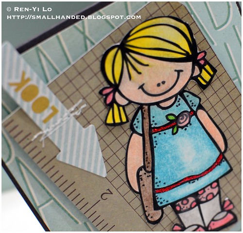
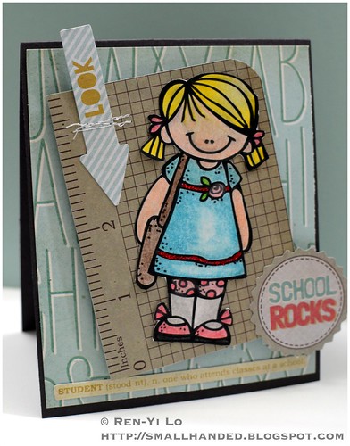
Stamps: (School Girl) Melonheadz Illustrating
Paper: (Paper Basics Card Stock - Smokey Shadow) Papertrey Ink; (Off to School) Fancy Pants
Ink: N/A
Embellishments: (Soft-core Color Pencils) Prismacolor; (Stickles - Xmas Red) Ranger; (Off to School - Cards, Design Embellishments) Fancy Pants; (Thread - White) Gütermann
This school girl is very adorable, ain't she? I decided to pull out some Fancy Pants to compliment this image. And since I was determined to use the "School Rocks" I lifted the color combo from there. Perfect - because if you know me, I have a thing for aqua and red ;) A fun element is using the "Student" definition to give the base of the card some fun "trim" along the base. Everything else is adhere on dimensionals, including the "School Rocks" label and the kraft graph paper panel with the girl. A little bit of messy stitching was necessary for anchoring the little arrow that was too cute not to use up. Anyways, here another close look on the cute little girl!
Hope it tickles. Do you have kids that are back to school? Is it a relief to be back in a routine? Make sure to check out the other DYSU girls' creation and leave them some love. This week we were discussing how many amazing DYSU players we have and how we love to leave you a comment to let you know how much we love your creations. We'd love to hear if we tickle your creative bone, too :)
On a last note, if you're a regular reader, don't forget to answer the survey in the top right panel. You have a little less than 2 days left ... And thank you to all that have participated! Toodles...
This week's sponsors:
Can You Digi It
* $10 Gift Certificate
My Heart Pieces
* Winner's Choice of 3 Digis
Melonheadz Illustrating
* $15 Gift Certificate
Thursday, August 23, 2012
[DYSU] Challenge #86 - Fantasy
It's time for another challenge here on DYSU. I can't believe how we're already heading towards the end of August. The summer is coming to a quick close, and I should seriously start thinking of Christmas cards or Christmas presents...
But before we get this challenge under way I have two pieces of great news to share with you.
- With Meredith leaving the team, we have one new person joining our team. You know her very well, because she has been a Guest Designer for multiple challenges. Yep - none other than our Helen Berry. I was tickled when she accepted our invitation. And I was prepared to beg, grovel, bribe...thank goodness she didn't have to witness those "class acts" ;)
- You won't be seeing Rebecca's creations for a couple of week or so. That's because she is busy being a new mother! How exciting is that? Stop by and leave her your congratulatory notes!
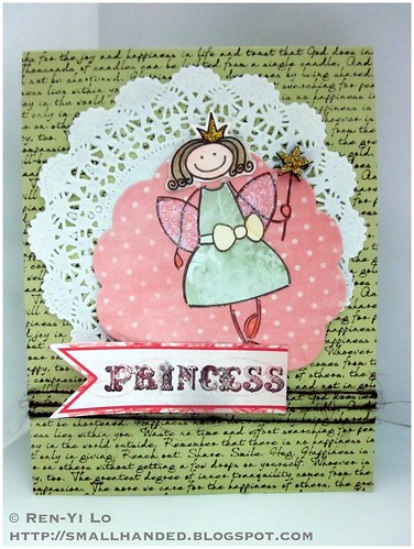
Stamps: (Text It, Heroines - Fairy Princess) Waltzingmouse Stamps
Paper: (Paper Basics Card Stock - Spring Moss) Papertrey Ink; (Porcelain) Basic Grey; (Lost & Found Market Street) My Mind's Eye
Ink: (Jenni Bowlin - No. 11 Brown Sugar) Ranger
Embellishments: (Soft-core Color Pencils) Prismacolor; (Nestabilites - Big Scalloped Circles Large) Spellbinders; (Ultrafine Prisma Glitter) Palette; (Stickled - Golden Rod) Ranger; (Brown Twine) Waltzingmouse Stamps; (Wood Veneer - Stars) Studio Calico; (Grab Box - Doily) The Craft's Meow
I added Stickles to her little crown and her wand. I decided that a wood veneer dressed up would be a little fancier! Her dress is paper pieced from Porcelain (Basic Grey) and sprinkled some glitter onto her wings. Isn't she a cutie pie?
Hope it tickles (or sparkles). Make sure to check out the other DYSU girls' creation. They are so creative and I feel so lucky to be designing along side from them. And make sure to say Hi to Helen...I'm sure we'll see you playing along, too!
This week's sponsors:
Through the Craftroom Door
* One Year PDF subscription
The Stamping Boutique
* Winner's Choice of 3 Digis
A Day For Daisies
* $16 Gift Certificate
Monday, August 20, 2012
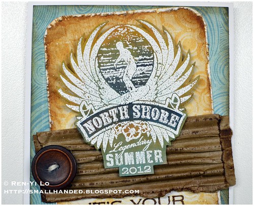
North Shore - It's Your Big Day
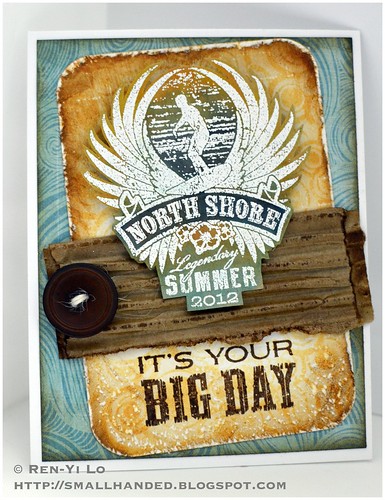
So my sweet, dear little (not so little if you know that he's 6'1" and I'm 5'2") brother is turning 25 today. A quarter of a century - now doesn't that sound old? Oh and then I think of how old I am and how he's my little brother...'nuff said.
I spent all Saturday afternoon with my mojo gone far away making a card for my brother. I actually like this quite a lot and feel like I can stand behind this creation. I just hope that my brother loves it as much I loved making it!
If you know my brother, then you know pulling "North Shore" out of my stash was a no brainer. Actually when I was debating which new gorgeous stamp sets to get, I deliberately added "My Island" and "North Shore" mainly because they made me think of my brother and make some fantastic focal points for cards. So I better get crackin' on inking them up :)
I also used Julia Aston's sketch from the Waltzingmouse Sketch Challenge as an inspiration. Don't look to close, because in the process of trying to follow this sketch, I think I kind of went off into my little world. Maybe the girls will give me partial credit ;)
So shall we get to it? I'm going to try to explain how I put this together, so that you can see how my thought processes went...so forgive me in advance for the long post.
Stamps: (North Shore, Free Spirit, Back in the Saddle) Waltzingmouse Stamps
Paper: (Paper Basics Card Stock - Basic White, Kraft, Rustic White) Papertrey Ink; (Paradise Beach) Echo Park
Ink: (Versamark) Tsukinkeo; (Jenni Bowlin - No. 11 Brown Sugar; No. 5 Chicken Feed, No. 4 Lemon Drops, No. 11 Malted Milk; Tim Holtz Distress Inks - Chipped Sapphire, Antique Linen, Vintage Photo) Ranger; (Perfect Match Pigment Ink - Hawaiian Shore) Papertrey Ink
Embellishments: (Vintage Buttons - Dark Chocolate; Rustic Cream Button Twine; Impression Plate - Linen & Canvas) Papertrey Ink; (Stamp 'n Stuff - White Opaque) Stampendous!; (Corner Chomper) We R Memory Keeper; (corrugated card stock from Papertrey Ink) Recycled Stash
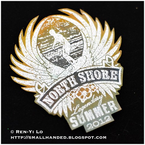
I started out with the main focal point of this card: the surfer dude panel. It is stamped in Versamark on Kraft and heat embossed in white powder. I knew going into this that I wanted to emboss white on Kraft because I love this combination. I also deliberately selected my regular Stampendous! white embossing powder and not the detailed stuff, because I wanted this to have some uneven coverage and the added texture. It goes quite well with the laid back feel, know what I mean?. Next I colored in the panels by pulling some ink off from my ink pads, including Chipped Sapphire, Hawaiian Shore, Chicken Feed, and Lemon Drop. After fussy cutting it out, this is what's left. As you can see, I even went with my inks over the white embossed parts, trying to force the colors into the small spots of Kraft that was exposed.
Next, I worked on the rectangular background: I actually ran this bit of Rustic White left over card stock through my Big Shot using the PTI Linen & Canvas Impression Plate. If you squint hard enough, near the height of the xacto blade you can see some "pocked marks." Those are from the plate. By doing this I am giving the card stock more texture before stamping, and I can re-create the effect I had with the white heat embossing above except with my inks. I wanted to create a feeling of water (I must admit I was staring at the flowers in the Free Spirit set and felt tempted since they match the little Hawaiian flowers on the North Shore stamp, but then thought of my oh so manly brother...) After layering the bubbles with Malted Milk, I distressed the sides heavily with Antique Linen and then Vintage Photo. Corner chomped at 1/2" and then took my Xacto knife to town. I scraped along the edges and this resulted in the very inked edges to come off, almost leaving the white deeper layers exposed. I stamped the sentiment (I chose this one because the lettering in "Big Day" has some distressing already etched into the design; do you see the white lines the brown Big Day sentiment?) on the lower half and then took my Xacto Knife and flicked off some more of the card stock creating small craters along the surface. This is what is looks like:
So here is where I ran into problem with the sketch. I wanted to create a trim, scalloped border, or corrugated cardboard going vertically along my card, but no matter how I looked at it, it just wouldn't work. Ever run into this kind of problem where it looked better in your head then on paper? Instead I recycle a piece of corrugated cardboard going horizontally. (I'll let you in on a secret, it's the stuff that Papertrey Ink uses to wrap my card stock properly so that the don't have dented corners.) I distressed the cardboard with more Vintage Photo and placed it right above the sentiment. A little button threaded in Rustic Cream Button Twine...
I actually had the toughest time trying to finish this card up. I was flipping through some Echo Park paper and couldn't decide if I like the orange or the blue better. The orange would have also looked quite nice and gave it more of a monochromatic look. The blue brings out the wee bit that I used when coloring North Shore and made it more dramatic. So I went with blue, although I kept waffling. The pattern paper was also distressed in Vintage Photo and then mounted onto the white card stock - balancing out the white embossing of the main panel.
This brings us to the end, and I'd like to mention that this is one card with lots of distressing techniques going on: the white embossing, the frayed edging on the bubbles panel, the corrugated cardboard, the distressed inking on all layers, the embossing onto the paper for added texture and the little craters along along the sentiment. And this brings me to Catered Crop's Recipe Swap - guess what their theme is? No Stress to Distress....
Also, I have mentioned the word focal point a few times above. That's the fundamental anchor to how this card started. In case you want to learn more about focal point, Paper Crafts is having a marvelous week of discussing design details in their Card Design Handbook Week. Since focal points are often the beginning point of what I consider when designing a card (like this one), I would like to throw this card into the mix at the Focal Point Challenge in the Moxie Fab World.
Hope you liked this lengthy post. I hope I was able to show you how easy it is to put a great card together, and how sometimes the most obvious or easy elements (like picking the right colored pattern paper) can be the most agonizing decisions ;) What parts take you a long time to decide? And how do you overcome it?
Friday, August 17, 2012
[Waltzingmouse Blog Party] Have a Blast on Your Big Day...
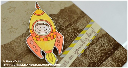
Hello everyone! It's time for another party, and this time I planned ahead. I was so sad when the last two parties snuck up on me and I was so swamped with work that I didn't have any more time to create anything. This month's theme is very practical, because I always find myself running out of these... Birthday. Yep, those I never have on hand. My mum also decided to commission a card for a one year old boy. So I thought I better pull out my Half-pint Heroes...
Stamps: (Way Out West, Half Pint Heroes) Waltzingmouse Stamps
Paper: (Paper Basics Card Stock -Kraft) Papertrey Ink
Ink: (Jenni Bowlin - No. 11 Brown Sugar) Ranger; (Versamark) Tsukineko
Embellishments: (Soft-core Color Pencils) Prismacolor; (3/8" Topnotch Twill Tape - Fine Linen) Papertrey Ink; (Yellow Airmail Washi) Freckled Fawn
All this new grunge hitting Waltzingmouse Stamps, made me want to make a "dirty" background. I tried stamping off the mountain range from Way Out West, and then stamping onto the card stock to get the lighter ones towards the top.
I colored this rocket up in some bright yellows & orange, and thought the yellow airmail washi could also double as "construction / warning" tape to draw some attention to the sentiment. I think it goes quite well with the rocket.
I also stamped the a sentiment on the twill ribbon. Twill by itself is great, it can be dressed up, or dressed down. It also acts like a blank canvas (especially the Fine Linen twill), don't you think?
So, I'm off to head to bed, but can't wait to see your lovely creations soon...Thanks so much for stopping by and enjoy the rest of what's left of this month! Summer is flying by so quickly, how will you make use of the remaining months?
Thursday, August 16, 2012
[Paperplay Challenges] Week No. 33 - Recycle / Upcycle
Note: If you are looking for DYSU Challenge Blog Hop - please keep scrolling :)
Hi there, again! It's Week 33. I must say I like this counting mechanism that PaperPlay Challenge employs, because it reminds me that we're more than half way to Christmas and only 19 more weeks until the year is over. 19! Really? Where does time fly. I also saw Kristina Werner tweet that it's really time to think about Christmas cards. My reaction was "Yikes, I'm not ready" but then again as a crafter, we have to stay ahead of the season. I laugh because I am still crocheting a birthday present for a friend who had a birthday in February. Ooops! Anyone else feel like they are always catching up? Please let me hear your thoughts and how you get yourself organized to stay ahead of the curve.
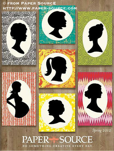
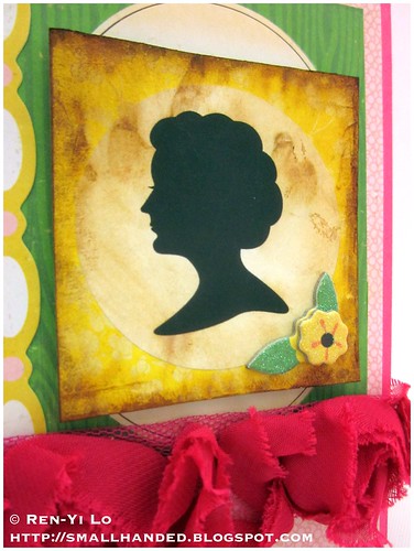
In the meantime, we have a fantastic new challenge here: Recycle / Upcycle. I was hoarding this magazine from Paper Source - Spring 2012, because I knew I wanted to use these silhouette images.
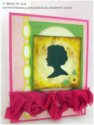
So I cut these out, glued them down on some thinner gray card board (the kind that you can find backing notepads, or in any kind of packaging), and created my own chipboard accent. Here the card I made with it...
Stamps: N/A
Paper: (Paper Basics Card Stock - Raspberry Fizz) Papertrey Ink; (Emma's Shoppe) Crate Paper
Ink: (Tim Holtz Distress Inks - Vintage Photo) Ranger
Embellishments: (Emma's Shoppe - Accent Cuts, Layered Chipboard, Border Stickers) Crate Paper; (Roses Ribbon Trim) Prima
I thought that the pink from Emma's Shoppe was the perfect color against the prima flowers and the base card stock. Here is an up-close look of the self-made chipboard and the wee layered chipboard from Emma's Shoppe. It's so pretty & sparkly, too!
Hope you like this little wee card. Hop on over to see how the rest of the PPC girls used a die! Hope you will be playing along with us this week...!
Our sponsor this week:
[DYSU] Challenge #85 - Buttons Blog Hop
Good morning everyone! Are you arriving from my talented crafty UK-friend, Pauline? I bet she left you with some very inspiring takes on this week's challenge. If you aren't coming from Pauline's then I encourage you to start from the beginning. But let's get on with the show...
As you can see from the DYSU Blog, we are dedicating this blog hop to none other than the brilliant Meredith. Meredith's stint on the DYSU team was short & sweet, but I would not have wanted it any other way. She's super sweet to have around and always so encouraging. And from her projects (as you can tell) not too shabby - quite the contrary actually. Often they leave me with my jaw hanging: I'm green with envy on her coloring skills, especially when it comes to hair; other times it's the way she uses her materials in unique & creative ways; even more, she has this keen sense of color combos and pairs up not-so-obvious things together. May I borrow your brain sometime? I do want to know how she comes up with these stellar creations! No matter what images you throw at her, she makes them into master pieces! (and I would know since I threw some tough ones at her) That, my friends, is talent! Well, Meredith, thanks for being teamies for a while, and don't ever be stranger. You know where to find me...I'm sure we'll stay in touch!
For this week I'm showcasing none other than Korin's Sweet 'n Sassy Stamps. I love her images and the team is so kind.
Stamps: (Berry Sweet Cocoa, Elly & Friends) Sweet 'n Sassy Stamps
Paper: (Paper Basics Card Stock - Pure Poppy, Spring Moss) Papertrey Ink; (Garden Variety) Cosmo Cricket
Ink: (Memento - Tuxedo Black) Tsukineko
Embellishments: (Soft-core Color Pencils) Prismacolor; (Ultrafine Prisma Glitter) Palette; (Stickled - Diamond) Ranger; (Border Punch - Upper Crest) Fiskars; (Vintage Buttons - Pure Poppy) Papertrey Ink; (Ribbon) Michael's
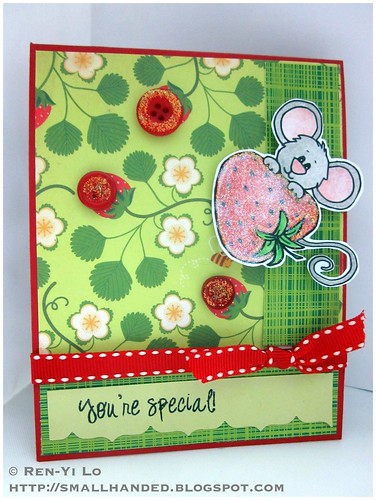
My pattern paper almost seemed like an obvious choice when i was flipping through my older (ahem, hoarded) papers: Garden Variety...aren't the berries just perfect? I do love this green & red combo, and for once I'm not thinking Christmas! This card actually makes me think summer (although strawberry season has been long over). I also added buttons as my strawberries and gave them a Stickles treatment to match Cocoa's big, sparkly berry.
Hope it tickles (or sparkles). Now off you go to to see Wenche in Norway. Looks like you're bouncing between continents...getting dizzy yet? And in case you get lost, here is the full list...Remember to hop all the way to the end to say goodbye to Meredith! I'm sure I will be missing her inspirations!
- Archana (using Robyn's Fetish)
- Barb
- Denise (using Robyn's Fetish)
- Jan (using Digi Darla)
- Joan
- Guest Designer Marcy (using Sweet 'n Sassy Stamps)
- Mary
- Pandy
- Pauline
- Ren-Yi (using Sweet 'n Sassy Stamps) <-- you are here
- Wenche (using Digi Darla)
- Meredith
Winner's Choice of 5 Digital Stamps
$10 Gift Certificate
Winner's Choice of 5 Digital Images
Sunday, August 12, 2012
Updates at Smallhanded Adventures
It was high time to finally update my blog. The margins and all the spacings were off and have been really annoying me for a (very long) while. So here are the results, what do you think?
In addition, there are a few changes here in "smallhanded adventure"-land... I thought it would be fun to run a little experiment. I'm putting up a survey feature on the blog (upper right). I'd love to get to know my blog readers a little better (and perhaps this will help you get to know each other) and if I can do so with a question or two, why not? It could be fun! So starting now, once a month, I will put up a new question and see what you guys think. For all I know, no one will answer the poll and this will be a huge flop, but why not try? I won't know until I do...
Then on every first Friday of the month, I will announce the results here on the blog-o and think up a project of some sorts that will be inspired by your answers... What do you think? And if it becomes a fun & popular thing, I'll put up a challenge and we can all partake in it. It can be anything: a card, a photo, a layout, a recipe, a short story...whatever moves you with the answers from the survey.
Any thoughts on this? Do you like these kinds of questions? Do you love statistics? Would you participate? Would love to hear your opinions in the comments...!
Ta for now...
Thursday, August 9, 2012
[DYSU] Challenge #84 - Four Legged Friends
Good morning everyone! Time for another challenge... Are you guys ready?
I do love this week's theme. It's a little unusual from our other themes and I was first stumped: Four Legged Friends. Well, it's not too difficult if you have dogs, cats, turtles or any other cute critters in your stamp set. But I was trying to think what I wanted to create - something that would make me happy, like this picture makes me. Isn't it cute?
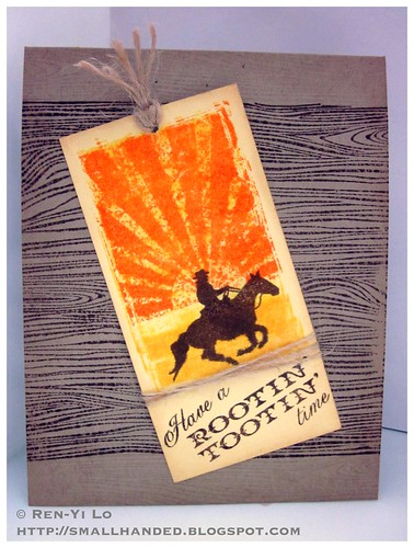
So this week I got to pull whatever I wanted out of my stash. And there is one particular four-legged friend that I was obsessed about when I was young. I was duly reminded about these four-legged creatures when I saw the equestrian jumping event during the Olympics broadcast. It was so obvious what I would pull out!
Stamps: (Back in the Saddle, My Island) Waltzingmouse Stamps; (Woodgrain) Hero Arts
Paper: (Paper Basics Card Stock - Lemon Tart, Kraft) Papertrey Ink
Ink: (Jenni Bowlin - No. 11 Brown Sugar, No. 10 Malted Milk, No. 5 Chicken Feed, No. 4 Lemon Drops; Tim Holtz Distress Ink - Antique Linen) Ranger; (Versamark) Tsukineko
Embellishments: (Jute Button Twine) Papertrey Ink
I use to have plans how I would keep a horse - in our tiny backyard or house in Germany (why not? Pippi Longstockings had a horse that stayed inside the house). If I moved to a city, I would buy out the top of the skyscraper and grow grass - it could graze at 150 ft above the ground. Why not? Right...
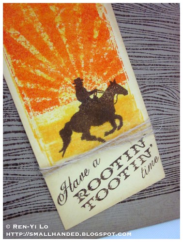
I wanted a nice manly background to go with the cowboy (or girl) and his loyal partner. To add more texture and layers without adding actual layers, I used Versamark to add a woodgrain pattern below and above the main part of the card. If you squint, you can see it in the picture below.
So how close did I get to owning an actual horse? This is it...
[Image Source: http://www.sunny-bears.com]
A lot less maintenance than the real thing, but I certainly couldn't ride this one ;) Hope you like the card - thanks for checking in. Now head over to the other girls's creations and remember to leave them some love :)...And don't forget to enter our challenge!
Our sponsors this week:
The Paper Shelter
* $20 Gift Certificate
Bugaboo Stamps
* Winner's Choice of 7 Digis
Thursday, August 2, 2012
[Paperplay Challenges] Week No. 31 - Layer It Up
Note: If you are looking for DYSU Challenge - please keep scrolling :)
Hi there, again! After missing Week No. 29 I thought I better make this a stunning card. This week at PaperPlay Challenge we are asking you to Layered It Up. So bring out your card stocks, your pattern paper, your foam squares or dimensional adhesives. I combined a variety of items onto my card....But before we begin I should show you my inspiration and all-time favorite challenge site... :)
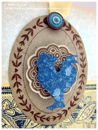
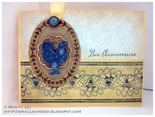
I keep putting off to ink my rooster from French Country, so I decided I had to use it no matter what. Yep, yep...the rooster is sort of iconic in my life, since I am a rooster by chinese zodiac. It's also such an iconic part of the kitchen, which you all know is my favorite part of the house!
Stamps: (French Country, Dainty Doily - Large Set, Oval Classic Frames) Waltzingmouse Stamps
Paper: (Paper Basics Card Stock - Lemon Tart, Kraft) Papertrey Ink; (Lost & Found - Portobello Road) My Mind's Eye
Ink: (Versamark) Tsukineko; (Jenni Bowlin - No. 11 Brown Sugar, No. 9 - Spice Tin; Tim Holtz Distress Inks - Antique Linen) Ranger
Embellishments: (Mister Huey - Shine) Studio Calico; (Luxe Satin Ribbon - Lemon Tart) Papertrey Ink; (Epoxy Brad - Moravia) SEI
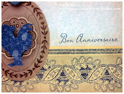
Started out with Lemon Tart card stock base and found this beautiful light blue pattern from My Mind's Eye. I would have added a layer of stitching but I was busy watching the Olympics and didn't find the right moment to dart back into the craft room. I also inked up the edges with some Antique Linen - my favorite distress ink.
This center piece is created out of three layers: the brown oval frame on kraft that I also watermarked with the reoccurring doily pattern, the brown doily on the same pattern paper, and then finally the rooster. I also found this gorgeous brad from an old SEI collection that I just love - it's so French Country, isn't it?
The rest of the card is just a sweet little sentiment - and since I'm always short on Birthday card, I thought I should pop this cute "Bon Anniversaire" on there. I love the font...just like perfectly handwritten script.
Hope you like this little wee card. Hop on over to see how the rest of the PPC girls used a die! Hope you will be playing along with us this week...After all, everyone always needs Birthday cards, right?
Our sponsor this week:
- Simon Says Stamps
Labels:
cards,
challenge,
paperplay,
waltzingmouse sketch,
waltzingmouse stamps
[DYSU] Challenge #83 - Polka Dots
Good morning everyone! Starting last Friday I have been glueing myself to the TV and cheering Team USA or Team Germany (depending on sport ;) on in the Olympics... It's been a great, because I have been moving & migrating my crafty supplies to the living room. It's slowly taking over, and Florian hasn't said anything yet...we'll see how long he'll tolerate this ;)
The first project I made in my new crafting arrangement was actually for this week's project. We're going with a trendy pattern Polkadots.
When I told Florian about this challenge he started singing this song from Madagascar 3. Do you know the Afro Circus song? It's become a repeating joke in our house...it's so horribly annoying but also catchy that it's getting eye rolls as a response.
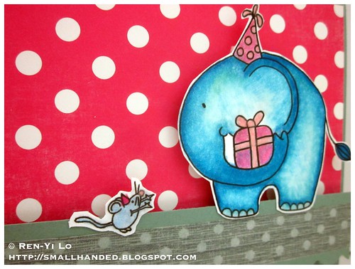
Anyways, onward with the card, shall we? This week I'm working with a Wags 'n Whiskers digi from Stamp & Create. Let's see if you like it...
Stamps: (Ellie and Squeak) Wags 'n Whiskers; (Botanical Silhouette) Papertrey Ink; (Off beat Backgrounds) Waltzingmouse Stamps
Paper: (Paper Basics Card Stock - Ocean Tides, White) Papertrey Ink; (Dots & Stripes) Echo Park
Ink: (Versamark; Memento - Tuxedo Black) Tsukineko;
Embellishments: (Soft-core Color Pencils) Prismacolor; (House of Three Soiree Collection - Twine) Pink Paislee; (Border Punch - Scallop Sentiment) Fiskars; (Elements - Wood Buttons) American Crafts; (Sketch Grey Polkadot) Freckled Fawn
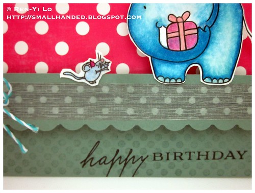
I added several polkadot elements: pattern paper by Echo Park, polkadot background stamp by Waltzingmouse Stamps in Versamark, and yummy washi tape by Freckled Fawn. Here is an up close look of the digital image from Wags 'n Whiskers, which is so adorable...
I knew that I wanted to have some kind of contrast between a dulled out aqua and raspberry pink, so Ocean Tide and the pink Dots paper from Echo Park was perfect. Everything just kind of fell together on how to color these cute critters. They are also popped onto the strip of card stock with washi tape. When I tried placing them on the pattern paper, the card looked too flat.
Anyways, hope you like it anyways! Check out the other girls's creations and remember to leave them some love :)...And don't forget to enter our challenge!
Our sponsors this week:
Broken Box Stock
* A "Toodle Club Membership" and a free Toodle Birthday Calendar. Total prize package is a $29 value.
Stamp & Create
* $25 Gift Certificate
Labels:
birthday,
dysu,
papertrey ink,
wags 'n whiskers,
waltzingmouse stamps
Subscribe to:
Posts (Atom)