

Funny enough, I'll be in San Francisco soon enough to attend a wedding, so I might have to swing by and have another delightful bite! In the meantime, here is the aforementioned wedding's card that I have created, using the delicious inspiration mentioned above.
Stamps: (Musical Backgrounds, Victorian Alphabet) Waltzingmouse Stamps
Paper: (Paper Basics Card Stock - Kraft, Dark Chocolate, Raspberry Fizz, Spring Moss, Plum Pudding) Papertrey Ink
Ink: (Perfect Match Pigment Ink - Raspberry Fizz, Spring Moss, Plum Pudding) Papertrey Ink; (Versamark) Tsukineko
Embellishments: (Perfect Pearls - Perfect Pearls, Super Fine Embossing Powder - Silver) Ranger; (Steel Dies - Signature Series: Butterfly ) Papertrey Ink
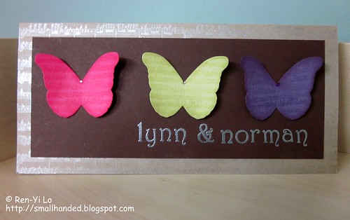
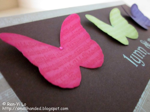
I stamped on the musical background onto the butterflies and decided to ink the edges of the butterflies with the matching inks. Each butterfly has a little gem in the middle to give it that little finish. Isn't it cute? I like how cheery they look.
To make the card a tad more special I decided to create a background of more musical notes onto the kraft and dusted with my Perfect Pearl. I love how it looks silvery on the the kraft - a little subtle shimmer to up the elegance on this spring wedding card!
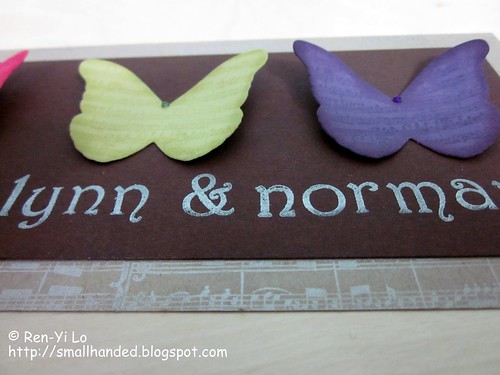
To personalize this card, I decided to heat emboss the couple's name on here. A slow and tedious lining up process, but I'm pretty happy with the way it came out. I had all these nightmare of it turning out crooked and uneven since the brown card stock was horrible to line up.
Just crossing my fingers that the spring wedding pair will love it. If not, I'll go drown my misery in a Macaron ;) Do you have special memories of certain foods from your travels? If so, what are they?
3 comments:
Yeah, that text! Wow, totally awesome line-up! Worth all the time it took! FAB FAB FAB!
That shimmer is amazing! Thanks so much for joining us at Embellish1
Beautiful, great interpretation of the theme!
Post a Comment