Thursday, June 24, 2010

A Cupcake Birthday Greeting

My weekly indulgence is to make time to prepare a card for the fun Waltzingmouse Sketch Challenge. This time I looked up the sketch challenge on Saturday and had all week to tinker with what ideas I could incorporate. Since I also had a shortage of birthday cards, it was pretty easy on deciding a theme.

I even promised myself to start early this week! But with an unexpected accident and a run to the ER in the middle of the night that resulted in stitches and an upcoming work deadline, the week had turned into such a chaotic one. Can ya relate?! So here I am, 
on my usual Thursday after work trying to throw a card and blog post together. I chose a bright red card stock to start. And here is what came into creation:
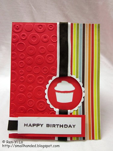
Happy Birthday
Stamps: Free Spirit - Sentiments (Waltzingmouse Stamps) 
Paper: Cardstock Paper - Red, White (Recollections), Offbeat (Basic Grey)
Ink: Earth Elements - Chocolate Chip (SU!)
Embellishments: Emboss A2 - Spots & Dots (Provo Craft), Nestabilities - Classic Small Ovals, Classic Scallop Ovals Small (Spellbinders), Celebrate-It - Brown, White (Michael's), Craft Punch - Cupcake (Martha Stewart)

That Provo Craft embossing folder had been sitting on my desk unopened for a while, and I decided I wanted a fun fun card. And since I was going to cut out a circle window I thought the emboss folder would fit my shape theme. 
Spots, Dots and a circle window later, I was on a mad hunt for bright & fun pattern paper and pulled out the Basic Grey. After I added that layer, a scalloped white frame was necessary to hide the transition from the pattern paper to the cardstock. 
At this point I needed to find something birthday-ish to stick in the window, and Martha's Stewarts punch was nicely within reach. The only debate was, white cupcake peeking from red cardstock, or red cupcake peeking from white cardstock? But that was quickly resolved after I saw that the white frame and the white cardstock didn't give too much contrast. So everything was adhered nicely, when I went about to find ribbon.

Not one ribbon seemed to match: they were either to thin or had crazy patterns. I didn't want pattern ribbon to add to the already craziness, and when I stumbled across my remainder white ribbon piece I thought I had something to work with. But everything still looked too "flat" and I thought a nice dark brown shade would do it, since the Basic Grey pattern paper had that nice brown stripe in it. Of course I'm not an engineer for nothing, and decided to create my own layered ribbon. I trimmed the white ribbon down the middle and adhered it to the left and right sides of the brown ribbon. I like the look, but I don't like the manufacturing quality, since it was a challenge to get it straight and evenly spaced. Can you see the un-eveness?

At this point I realized my newbie mistake. I wanted to run the ribbon through the hole and tack it on the back of the card, but my cupcake stack was in the way. Ooops. Two quick peels & one adhering job later I was close to done!

Reached for my favorite set o' stamp, and pulled a quick birthday label together. And with the little home-made ribbon scrap (that took so much love to put together), I created a little loop to finish it all :)

So here is hoping I can sneak in my whirlwind creation on time. I love how it "just came together." This actually goes against my plan-ahead personality, so I'm really surprised by how it turned out. Do you ever start without a real plan?

Thursday, June 17, 2010

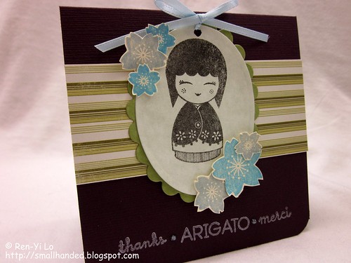
Thanks::Arigato::Merci

Another fun Waltzingmouse Sketch Challenge has inspired me to get my carding groove on.  Don't get used to so many posts in one month -- much less in one day. It's all just poor coincidence and a horrible need to want to participate and try everything. Not to mention I've been getting really excited about the comments that pop up on my blog. It's proof that someone skimmed or at least looked at the pretty pictures making it all worthwhile! Thank you ladies -- you are my motivation! On to card deets, shall we?

I recently received a wonderful hand-made gift and wanted to created a thank you card in attempt to express how much I loved the gift.  


Thanks - Arigato - Merci
Stamps: Arigato (Hero Arts), Asian Gardens (Waltzingmouse Stamps), Mega Mixed Messages (Papertrey Ink) 
Paper: Preppie Pack - Plum (Bazzill Basics Paper), Dotted Swiss (Bazzill Basics Paper), Cream (Recollections), Marbled Grey (Scrap Pack Recollections), Paperie Poolside & Greenhouse (Making Memories)
Ink: Brilliance - Pearlescent Blue, Pearlescent Sky Blue, Graphite Black (Tsukineko)
Embellishments: Nestabilities - Classic Small Ovals, Classic Scallop Ovals Small (Spellbinders), Ribbon O' Spool - Light Blue (Offray), Stickles - Baby Blue (Ranger)

I am still trying various supplies out and must say I love how the Brilliance ink comes out on dark card stock. The picture, unfortunately, does not show the true warm color that the Plum card stock really is, but I thought a green would complement the rest of the card well. The color combo was probably influenced by all the Asian Garden set I had on my mind (when I was cutting out those tedious flowers) and because I kept craving green tea during my crafting session. The oval image begged to be framed on a nice scallop and by creative license I left out the yellow panel of the template. And there you have it. Here is hoping that the recipient does not read my blog first ;)

I can't wait to see what the other gals made...

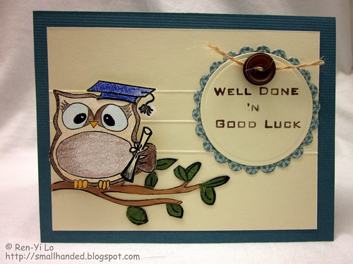
Well Done & Good Luck

The June Waltzingmouse Blog Hop's theme is "Let's hear it for the boys!". And to accompany this theme I have a story for you ...

My recent trip to Sequoia National Park was filled with many adventures and inspirations to make cards. Among one of the days of exploration, a bunch of friends and I went up Moro Rock. It is a rather distinct granite dome structure that has a well-built stairway for the visitors to climb. At the top there is a beautiful view of the Great Western Divide as well as a 360 degree view over the western park of the Sequoia National Park. After we finished our tour we got back into the car and drove off and while looking back I got a great snapshot of the rock and exclaimed "Look Moro Rock is Olivia the Owl -- sleeping." My friends thought I was nutso, but tell me, don't you see the resemblance?


Moro Rock

A distinct 3/4 view of an owl sleeping. I tell you, those boys have no creativity! I immediately noted that upon my return I had to make a card pulling my beloved "Owl Celebration" from Sweet 'n Sassy Stamps. And here is what I came up with:

Graduation
Stamps: Owl Celebrations (Sweet 'n Sassy Stamps), Owl Occasions (Sweet 'n Sassy Stamps), Free Spirit - Sentiments (Waltzingmouse Stamps)
Paper: Lucky Teal Cards & Envelopes (Creative Imaginations), Crinkle Cardstock - Olive (Wausau Paper), Real Wod (Creative Imaginations), Cream (Recollections), Offbeat - Lighthearted (BasicGrey)
Ink: Earth Elements - Close to Cocoa (SU!), Pigment Ink - Black (Colorbox)
Embellishments: Nestabilities - Standard Small Circles, Classic Scallop Circles Small (Spellbinders), Jute Packaging Twine (Westim Crafts), Vintage Button Collection - Brown (Papertrey Ink), Point 88 - Art. No. 88/46 (Stabilo), Softcore Colored Pencils - PC933 Violet Blue, PC946 Dark Brown, PC1002 Yellowed Orange, PC1015 Deco Blue, PC1034 Golden Rod, PC935 Noir (Prismacolor)


Another cousin just graduated high school and thought a sentiment that captured both congratulating him and wishing him off to his next four years of schooling was appropriate.


This card has also been entered to the Scrap Our Stash's June Sketch Challenge because I can always use the added practice to execute a sketch. I find it hard to keep true to the templates and always take creative liberties. Here are mine:

  • I flipped the sketch vertically and horizontally to accommodate my stamp restrictions (digis would have more helpful in this case ;), since Olivia the Owl's branch looked better coming from the left.  
  • By keeping the branch on the left I could create visual arc lines with the branch and the top half of the circle, as inspired by the dotted arc lines in the sketch
  • The three scored lined was an interpretation of the five segments of the sketch. This allowed me to segment my paper and anchor my design more cleanly.
  • The button with a bit of man-ly twine substituted for the flower
Other "hacks" included:
    • Adding the "&" into the sentiment, by piecing it together from other parts of the Free Spirit Sentiment set
    • Cutting along Olivia's hand, to stuff the diploma under her feathery fingers
    • Paper-piecing the tree together using wood and other paper
    Hope you like it. Have you had any vacation-inspired cards?

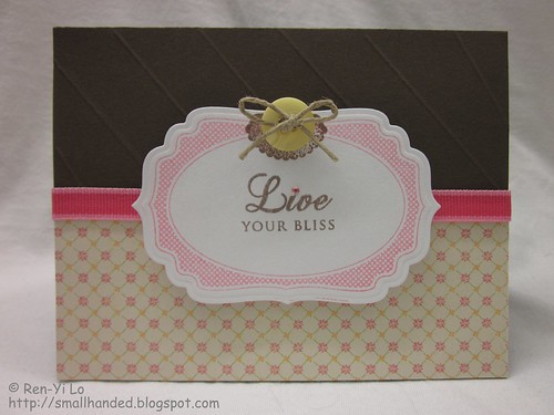
    Live Your Bliss

    I saw this fun challenge on Claire's blog. I've been itching to use more of my nestie-friendly stamps from Waltzingmouse Stamps, so I decided I would throw a card together with this hot color combo and try to step up to the challenge to center it around the label as a focal point.


    I didn't have any particular design in mind when I started this card. I just knew that I wanted my card base to be brown and my label coral. I was looking for an appropriately-sized sentiment to complement the label. I stuck with a paler yellow, since I did not have matching bold yellow in my stash. I tried to use "rules of 3" with my coral (i.e., ribbon, twinkle, and label). And this is how it turned out.  


    Live Your Bliss Card
    Stamps: Very Vintage Label No. 4 (Waltzingmouse Stamps), Mega Mixed Messages (Papertrey Ink) 
    Paper: Close to Cocoa (SU!), White (Recollections), Sophie Paper Pad (K Marcella)
    Ink: Earth Elements - Close to Cocoa (SU!), Brilliance - Pearlescent Coral (Tsukineko)
    Embellishments: Nestabilities - Label Four (Spellbinders), Vintage Button Collection - Spring Mix (Papertrey Ink), Taylor's Tiny Twinkles - Multicolors (Taylored Expressions), Hemp Cord (Darice), Ribbon - Coral (Michael's)

    I also tried scoring at an angle. Unfortunately I do not own a Score-pal, so scoring on my Fiskar's cutting board was rather tedious. Can you see my mistake? ;) Well, at least I know what I'll be spending my 50% off coupon at my next craft store visit...

    Tuesday, June 8, 2010

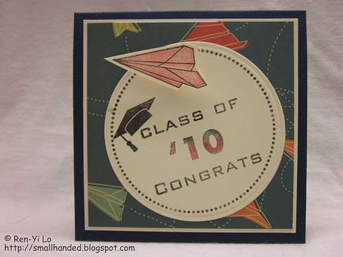
    Class of '10 Congrats

    "Uh oh" was my thought when I boarded my plane last week to SFO. I was reflecting on the great news that my brother was now gainfully employed, when I realized to my horror that my two cousins also had graduated - one from Boston University (also with honors ;) and his brother from his local high school. So somehow many of the boys in the family were hitting milestones. And with Father's Day coming up...I have my work cut out to think man-ly cards!

    Inspired by my flight, I was determined to make a card with planes, and thought of the Free Spirit - Boy from Walzingmouse Stamps. Isn't that paper plane just pure hotness? As a avid paper plane engineer, I could not wait to return from my trip to make this card. Coincidentally, I also returned just in time to play along Waltzingmouse Stamps' first sketch challenge. So, without further ado...

    Graduation
    Stamps: Free Spirit - Boy (Waltzingmouse Stamps), Free Spirit - Sentiments (Waltzingmouse Stamps), Vintage Circles, Small (Waltzingmouse Stamps) 
    Paper: Preppie Pack - Oxford (Bazzill Basics Paper), Cardstock - Cream (Recollections), The Boyfriend - Study Hall (Cosmo Cricket)
    Ink: Earth Elements - Ruby Red (SU!), Brilliance - Graphite Black (Tsukineko)
    Embellishments: Nestabilities - Circle, Small (Spellbinders)

    I have grown quite fond of the Free Spirit set. It makes the daunting task of making boy cards fun! My formula for a boy card is: 

    Boy Card = good boy stamp set + bold colors + boy-specific pattern paper

    Now, it's your turn. What are you favorite boy stamp sets? What fool-proof formulas do you use?

    Psst - if you haven't entered the WMS Sketch Challenge, run to your scrap desk and create something. One can never have enough Waltzingmouse Stamps ;)

    Monday, May 24, 2010

    Hip Hip Hooray...

    Graduating from college is one of those huge milestones that I like looking back on. It seems like yesterday that I was slaving through my assignments in the computer cluster...much less did I think my little brother's graduation was going to come this soon! He graduated last weekend with HONORS (more than I can say ;) and the whole family was there to cheer him on as he walked across that stage to receive his diploma. Between all the "whoop whoop" yells and "don't trip!" thoughts I was very proud of him...

    So to celebrate this big milestone I decided to ink my new Waltzingmouse Stamps and enter Steph's generous challenge. In case you're wondering, Steph is one of my Swapping Sisters and I've been enjoying getting to know her through this little fun online get-together. Read her blog entry to know what an inspiring person she is...

    Her challenge is to enter the Scrap Our Stash May Challenge and do something "Outta the Box." In my case, since I'm such a newbie card crafter, every little new thing I do seem like stepping out of the box. Perhaps the expert crafters can relate to this feeling. So here I am presenting my 8th card:

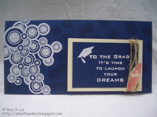
    Ren-An's Graduation
    Stamps: Free Spirit - Boy (Waltzingmouse Stamps), Free Spirit - Sentiments (Waltzingmouse Stamps)
    Paper: Preppie Pack - Oxford (Bazzill Basics Paper), Off-white (Recollections)

    Ink: VersaMark - Watermark (Tsukineko), Ruby Red (SU!)
    Embellishments: White Embossing Powder (Stampendous!), Jute Packaging Twine (Westim Crafts)

    Why is this "out of the box" for me? 
    • Non-A2 card format: Since the graduation gift was going to be a cash, it needed to fit in card nicely. 
    • Better cardstock: I recently hit a frustration point when making card that my current "Recollection" card stock (at 65 lbs.) is not cutting anymore. So I have upgraded to Bazzill cardstock (80 lbs.) until I can find better. Any recommendations? I am leaning towards GinaK or PTI, but would love to hear your input. 
    • VersaMark as inking: I have seen so many lovely examples used, where VersaMark would be used to deepen the shade of the card stock with a stamp image. This actually resulted in a boo-boo. Can you guess what it was? I tried to put a border along the bottom of the card. But since the stamp image was not long enough, I tried to line it up and it resulted in a mess that I decided to cover with the sentiment. After that the card looked like it needed a little something else and I decided to use the individual circle to create a random versa-marked background.
    • Keep it simple: I never seem to be able to stay to just two colors. So this time I practiced restraint. Notice that I couldn't resist with the red surf board. But overall I think I kept my intent...
    Overall I am pretty happy with this card. Helps that the brother likes it.  What are some "Outta the Box" things that you have tried lately? Were you happy with the results?

    And by the way, if you are reading this and haven't entered the challenge, go play Steph's challenge. She's extending it to May 28th and there are fun fun give-aways.

    Friday, April 30, 2010

    Waltzingmouse Stamps - The Biggie Challenge

    Claire from Waltzing Mouse Stamps turned One! So if you have not given her your congrats, hop on over and leave her a comment.  Claire, in celebration of her company's 1-year, is releasing EIGHT(!) new, magnificent stamp sets this May and has offered a very generous challenge, allowing us all a chance to win each of her new 8 sets! So I couldn't pass up the opportunity to play...We're talking about high stakes here!


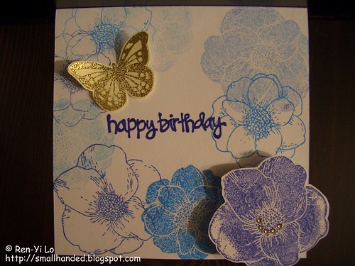
    A friend's birthday was just around the corner and i took it as an opportunity to make a fun card for my dear friend. With no circle die cut or punch around, I took the liberty of interpreting the sketch in my own little way. Here is what I came up with:

    WMS The Biggie Challenge
    Stamps: Flowers Bouquet (Martha Stewart), Butterfly from Embossing Stamp Set (Martha Stewart), Sentiment (?)
    Paper: White (Recollections), Off-white (Recollections)

    Ink: Momento - Paris Dusk, Summery Sky, Blue Danube, Bahama Blue (Tsukineko), VersaMark - Watermark (Tsukineko)
    Embellishments: Gold Embossing Powder (Ranger), Sparkling Diamonds (Memory Box), Golden Rod (Prisma Markers), Blue - Art No. 88/41 (Stabilo)

    I've been wanting to make my own pattern paper for a while now, and decided to go crazy and make some blue flowered paper. I knew that I wanted to create one bold flower and pop it off the page after I looked at the sketch. Therefore, my darkest blue ink was set aside for that. The nice thing with the MS's flower stamp set is the versatility of solid and line flowers. I tried to balance the blues with the solid and line types of flowers, but I'm not completely happy in how it turned out. Next time, I want to try less ink shades (i.e., maybe just pick two or three colors, rather than four) or stick with one type of flower (i.e., all lines or all solids).

    Next I stamped the sentiment with Paris Dusk, but didn't like that it was not bold enough. To make the sentiment darker, I took a dark blue Stabilo pen and traced the sentiment over with the pen.
    The butterfly was a natural accent to tie the flowers together. And I did have to satisfy that top circle in the sketch somehow ;) So, off I went to heat emboss it in a nice, rich golden color to complement my bouquet of blue flowers. To balance the gold butterfly, I added a few clear gems, that I dutifully colored with my Prisma marker to match. So all in all, a fun card!

    The one revelation that I came to, as a n00b (or newbie) to paper crafts, is the quality of card stock paper. The 65 lbs. paper does not cut it anymore for me. I easily get frustrated when mounting things to the base, and everything feels too unstable. A good card, after all, should be able to prop up and stand on its own, right? So my question to you, what kind of card stock do you use? And what were your first revelations when you started crafting that made you frustrated?
    Related Posts with Thumbnails