Actually, I wanted to point out the spelling difference, because it's a nice little reminder of how international our little group is! We are thirteen girls and we represent 6 countries. The representation covers Canada, Holland, Norway, United Kingdom, and United States + territories (special props for Puerto Rico representation). So do stop by the girl's blog and leave then a colo(u)rful comment, won't ya?
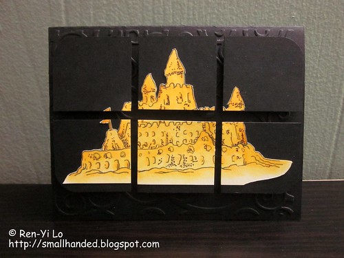
I am featuring an image from Copic Marker Scrapbooking. It's a fun image to remind us that our summer days are counting down. I'm currently in Detroit and was ready for sweltering heat, but instead, it's cold and rainy. Boo!

Stamps: (Sandcastle) Copic Marker Scrapbooking
Paper: (Paper Basics Card Stock - True Black) Papertrey Ink
Embellishments: (Soft-core Color Pencils) Prismacolor; (Cuttlebug A2 Embossing Folders - D'Vine Swirls) Provocraft
I colored this little image with some color pencils, because I don't own any Copic markers (yet!). Sorry, Copic Marker Scrapbooking folks!
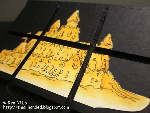
The challenge to use only one color (and only a wee bit of it) almost drove me to madness...It was a fun way to push boundaries and decided to chop up the image and give it a tiling effect. After all, there is only so much you can do with only black, right?

Some of the girls said it looks like the sandcastle is glowing. Hopefully in a good friendly, not Halloween-y or scary way. Well, let me know what you think ;) In the meantime, go check out the other gals' *amazing* work and come play along. If I can do throw something together for this challenge, so can you!
Our sponsors this week:
 | 6 copic ciao marker (North/South America), Martha Stewart punch (rest of the world) |
 | Winner’s Choice of 3 Digis |
 | 1 year PDF subscription |

11 comments:
supercoole idee, das gekachelt anzuordnen!!
Its just spooky good, not spooky scary Ren-yi. Some challenges are definitely hard, but that is when we are likely to learn something. I think I learned I don't play well with black! LOL
Hugs,
PeggySue
Wow, I love your card! Very different and beautiful!!
Fabulous card, so cool....
-Wenche
Great card - love how you have tiled the image. This was a difficult one for me too!!
Hugs
Denise xx
great card Ren Yi, love what you did with the image those tiles look fabulous (great idea)
and don't tell anyone, but I only have 1 copic marker (a fineliner, grey)
I alwasys use colourpencils or watercolours
hugs
Miranda
You did such an amazing job! I just love how you made your image pop off the page.. you really did great with this challenge.. I really love your pop of color..
HUGS
Alison
DYSU-owner
I love the tile effect and the coloring. It looks like the sand castle is shining. Great job!! Hugs,
Joan
Yes it really does 'glow' - very romantic
Hi Ren-Yi,
What a beautiful card, and you did awesome job coloring the image. I do too don't own any copics. TFS. Hugs--Tenny
A unique card with great contrast in colors. Good job!
Post a Comment